This Week on Xbox: 2026
Xbox . October 2025
Overview
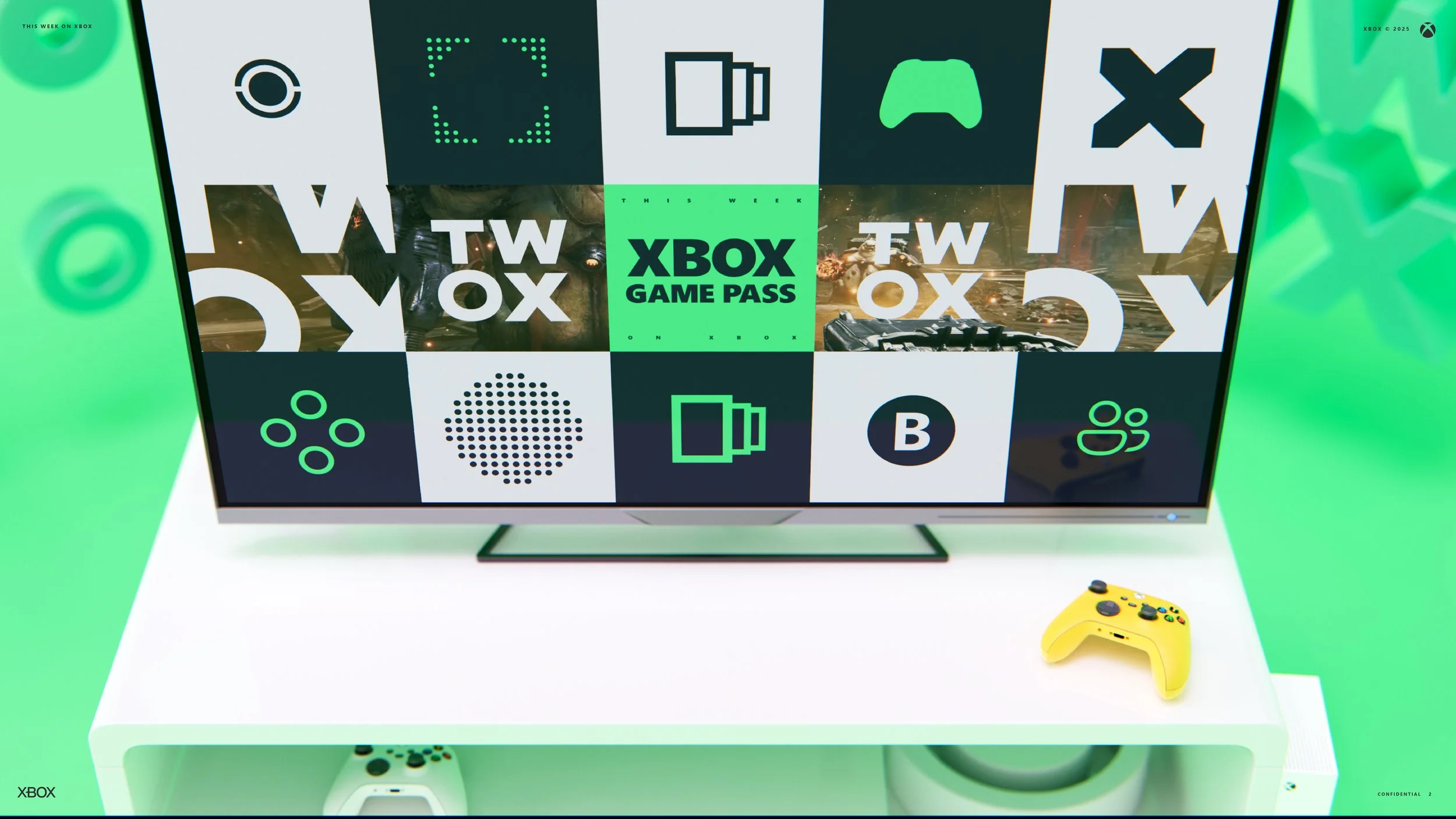
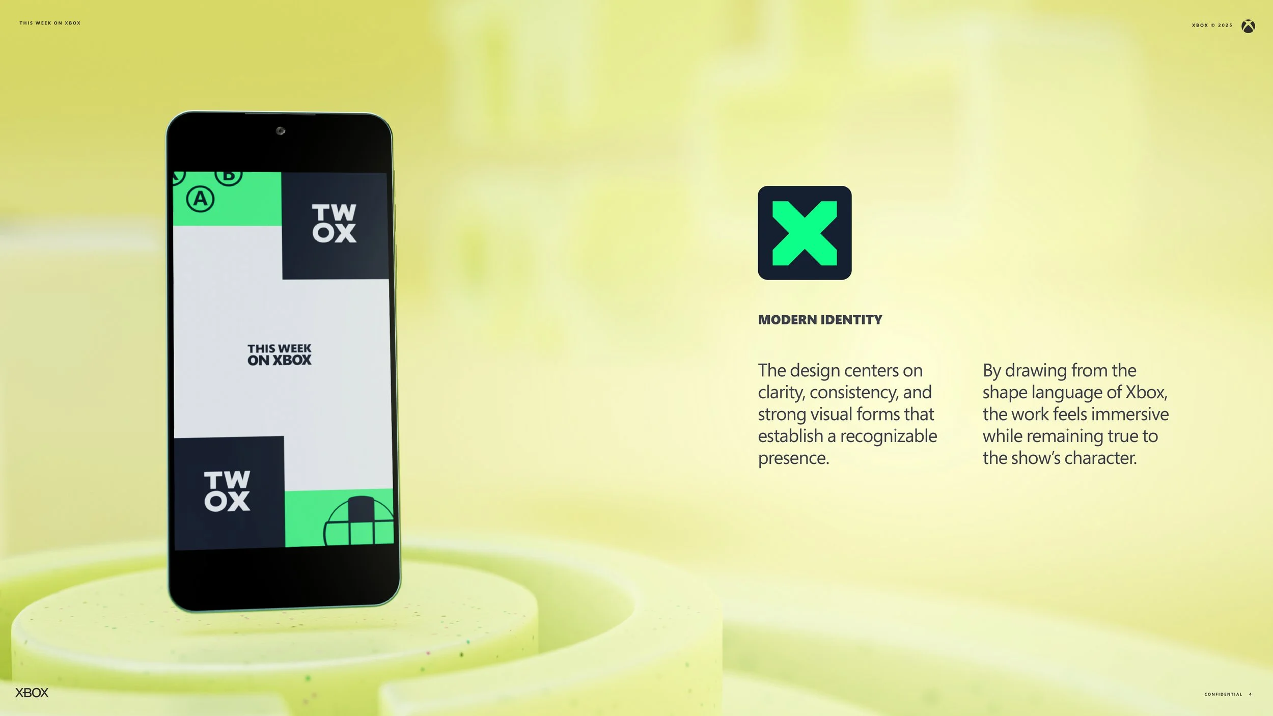
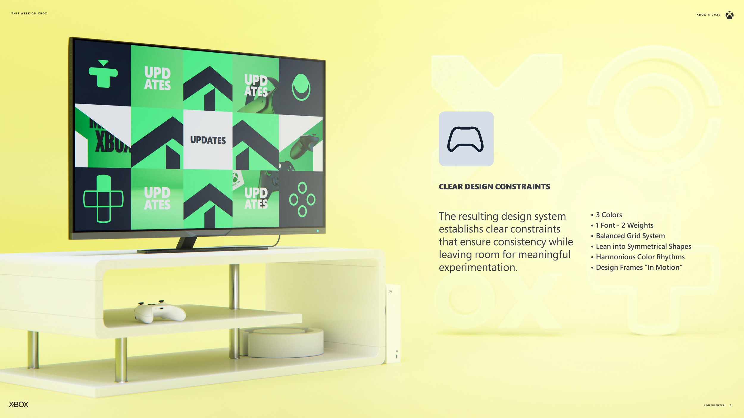
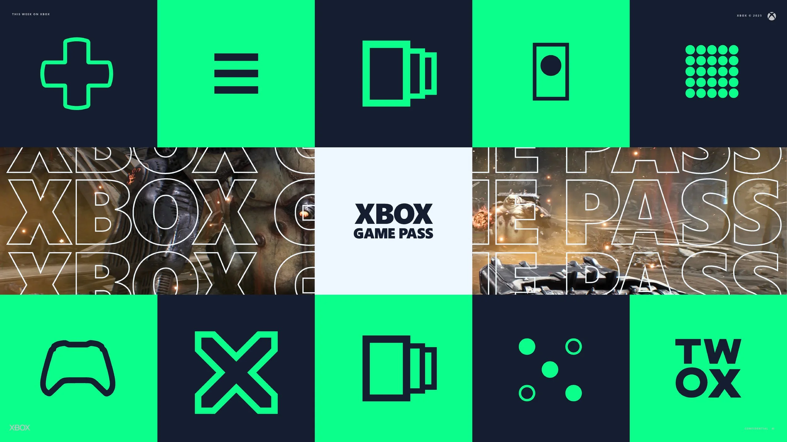
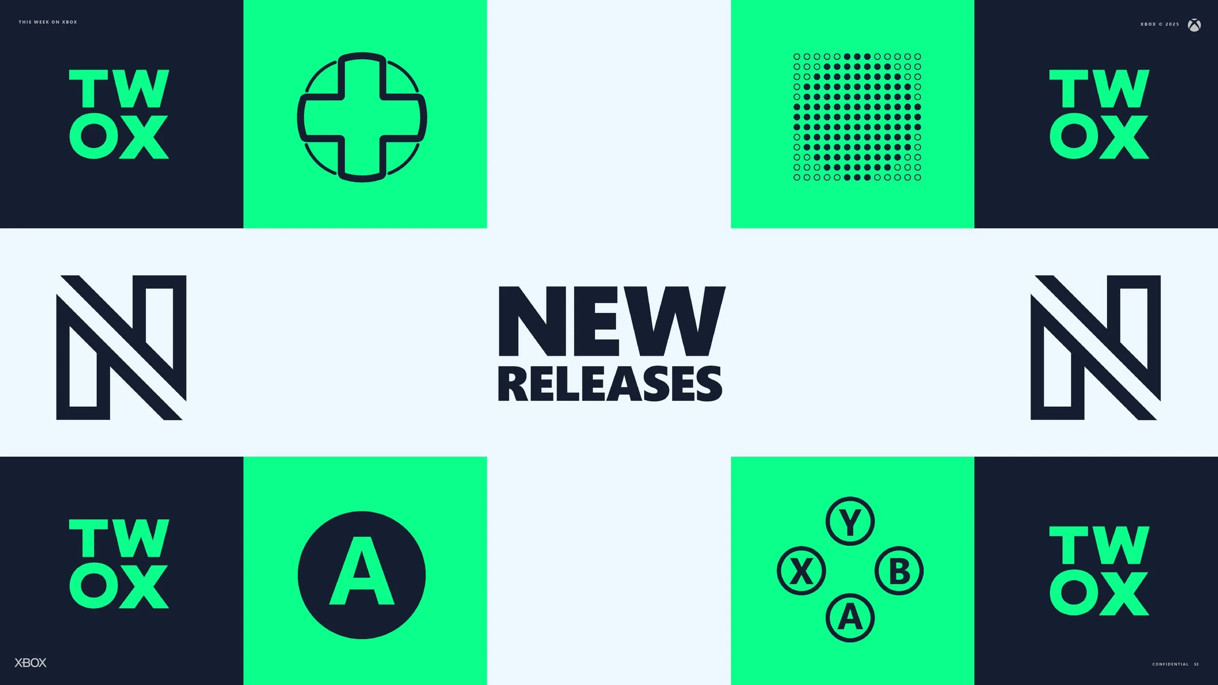
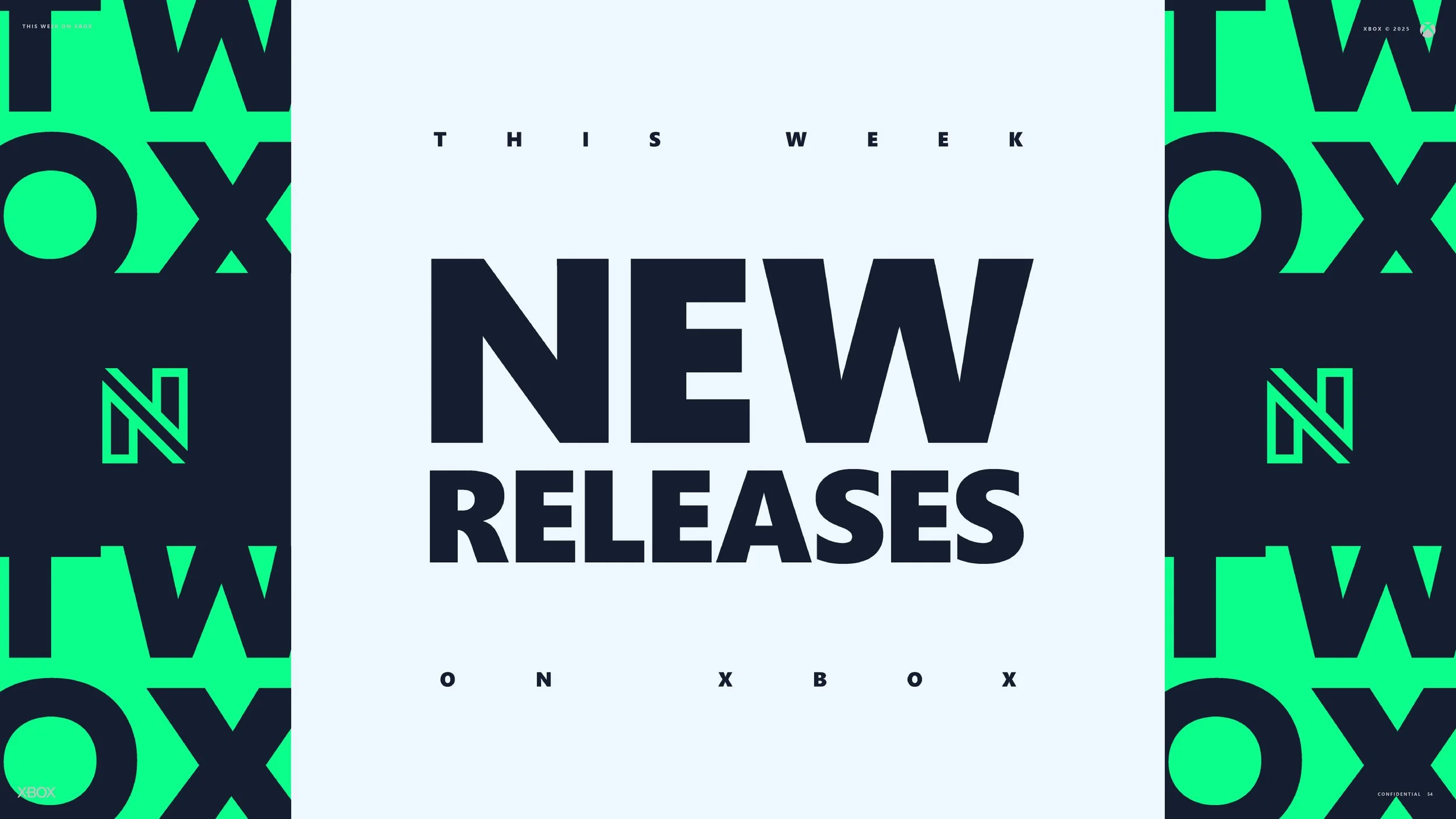
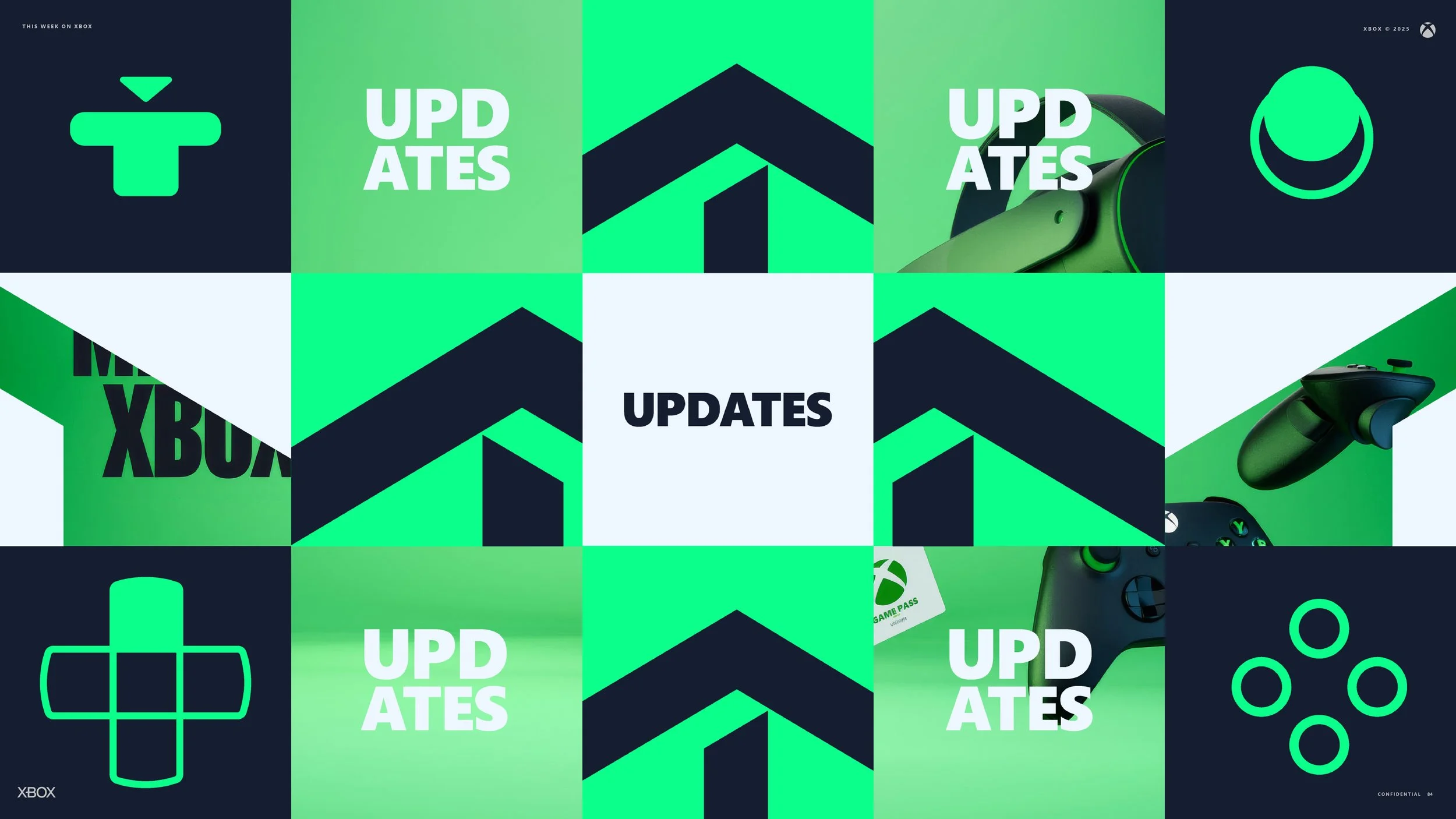
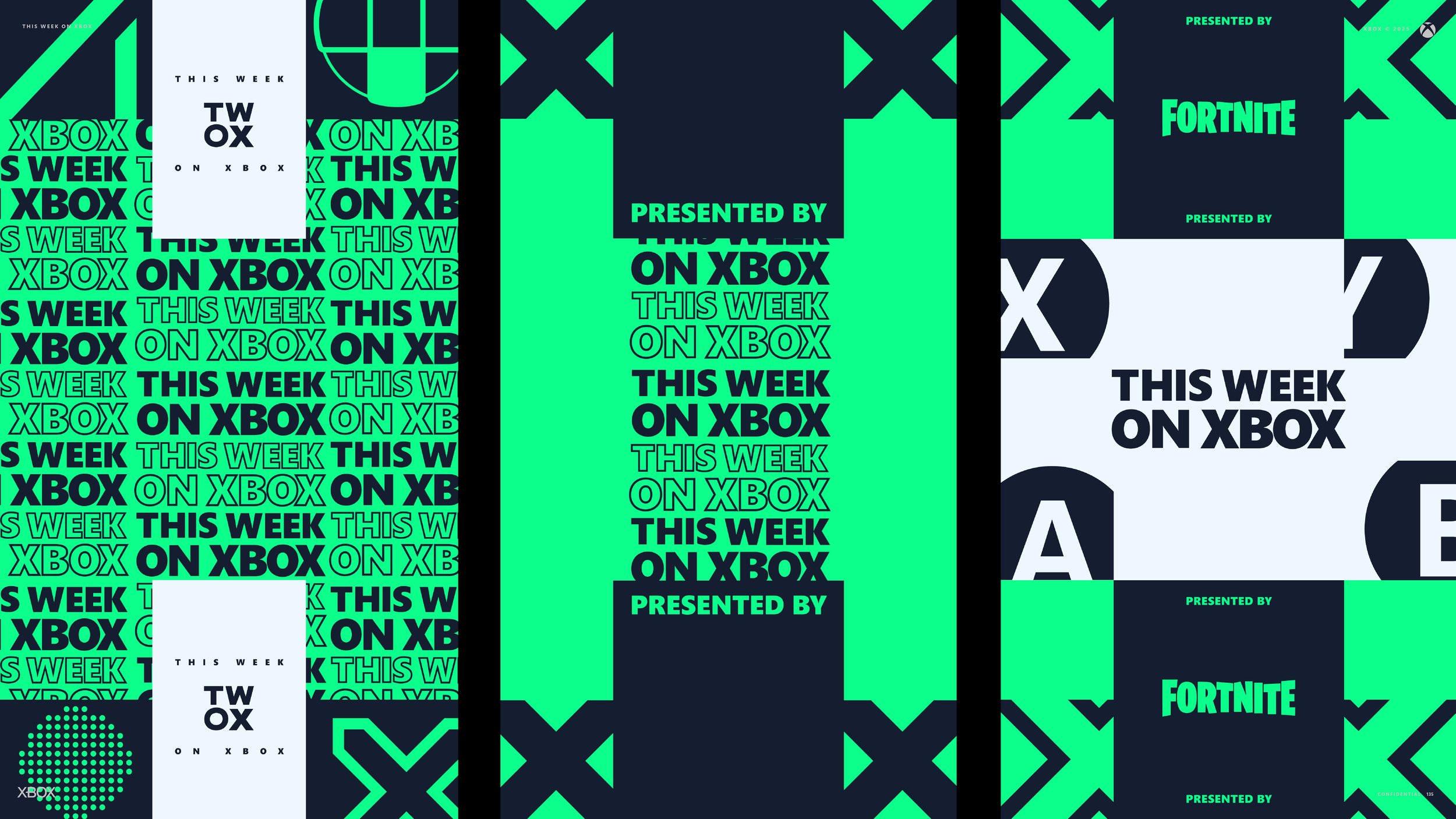
This Week on Xbox (TWOX) is Xbox’s official monthly program that presents what is new across the platform with clarity, consistency, and a modern visual identity. It is not a news show but a focused content built around rhythm, orientation, and trust. The design system reflects this intention. This redesign relies on three colors, one typeface, strong symmetrical forms, and animation that treats each frame as if it were already in motion. The result is a show that feels deliberate and contemporary, with visuals that adapt quickly to weekly production needs while maintaining a cohesive presence.
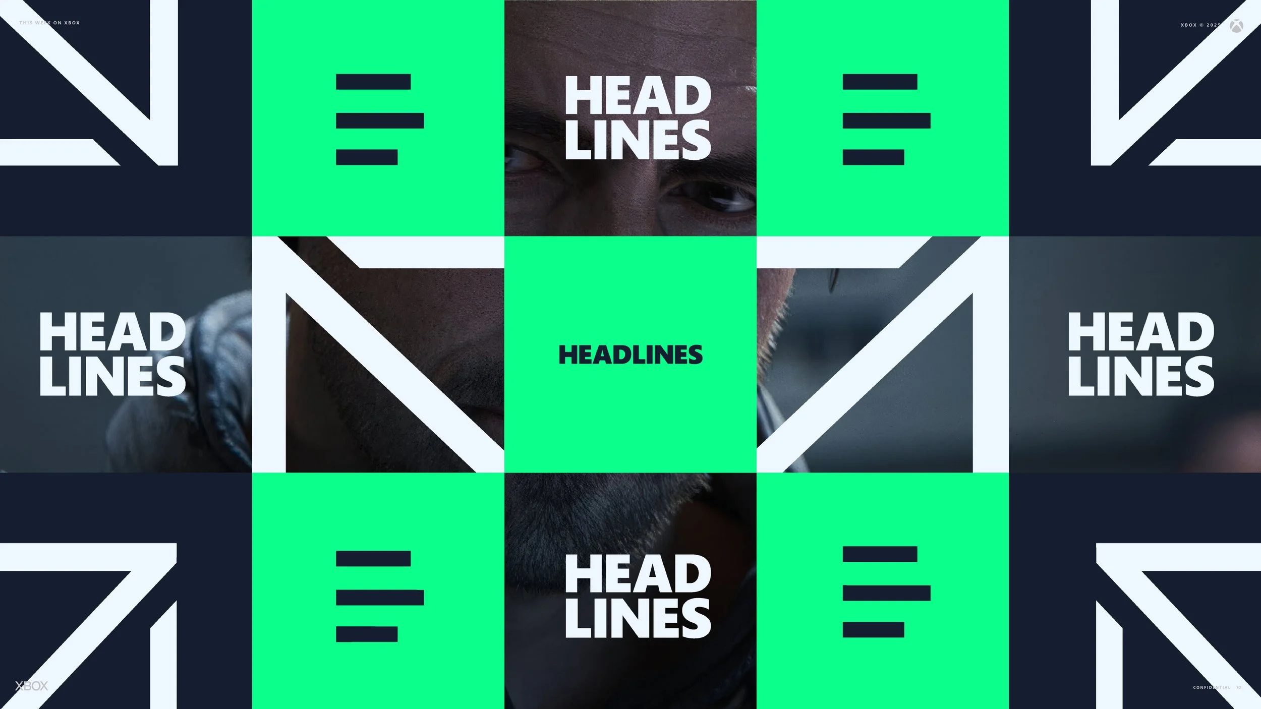
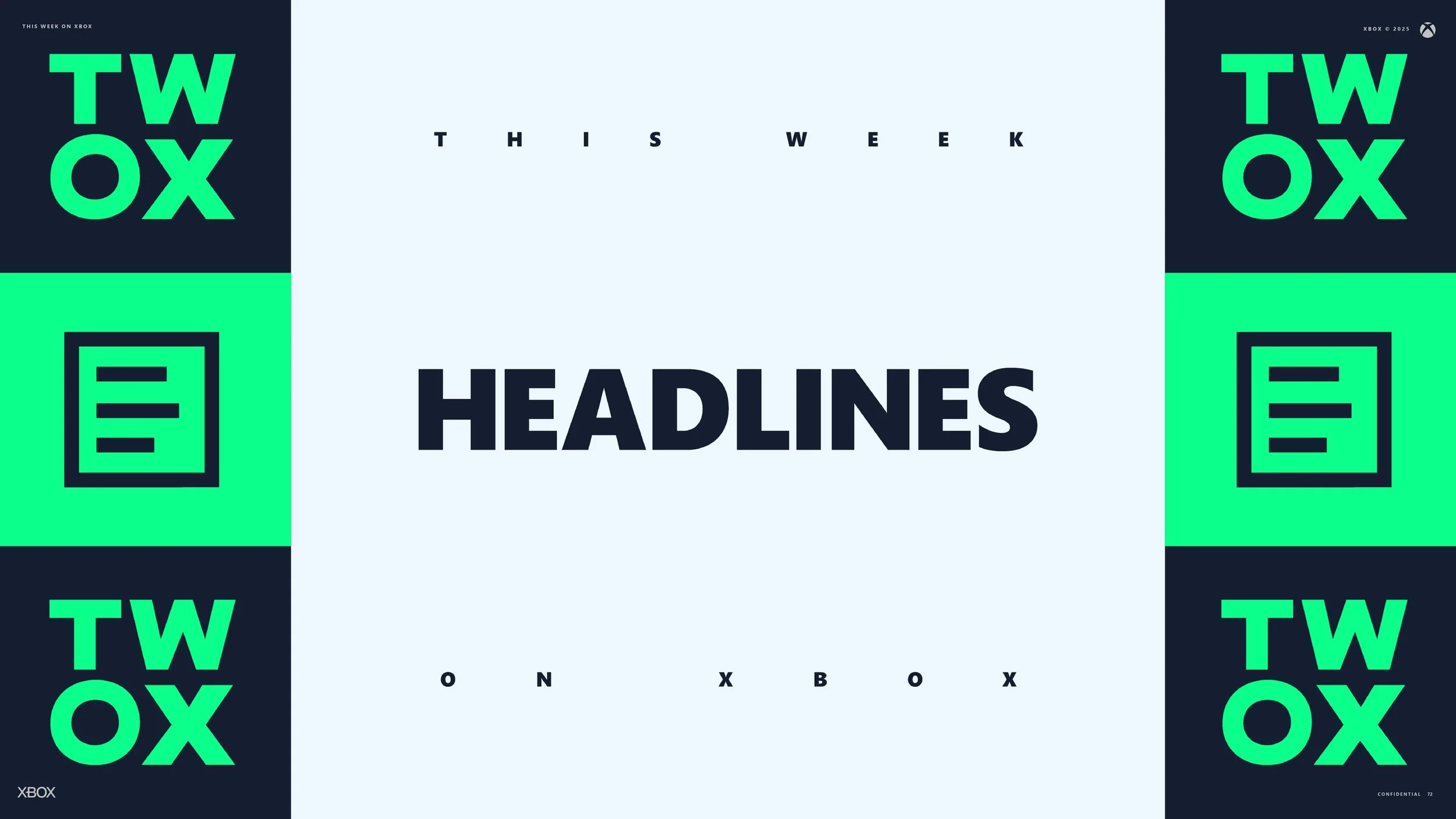
Each segment is defined by clear hierarchy, responsive lower thirds, and motion design that reinforces meaning rather than decoration. It becomes a predictable and engaging touchpoint for players who want to understand what is new, what is coming soon, and what is worth their attention. The show does not attempt to recreate news or editorialize. Instead, it acts as a trusted guide, presenting official information with care and restraint while strengthening the overall identity of Xbox.
Case Study
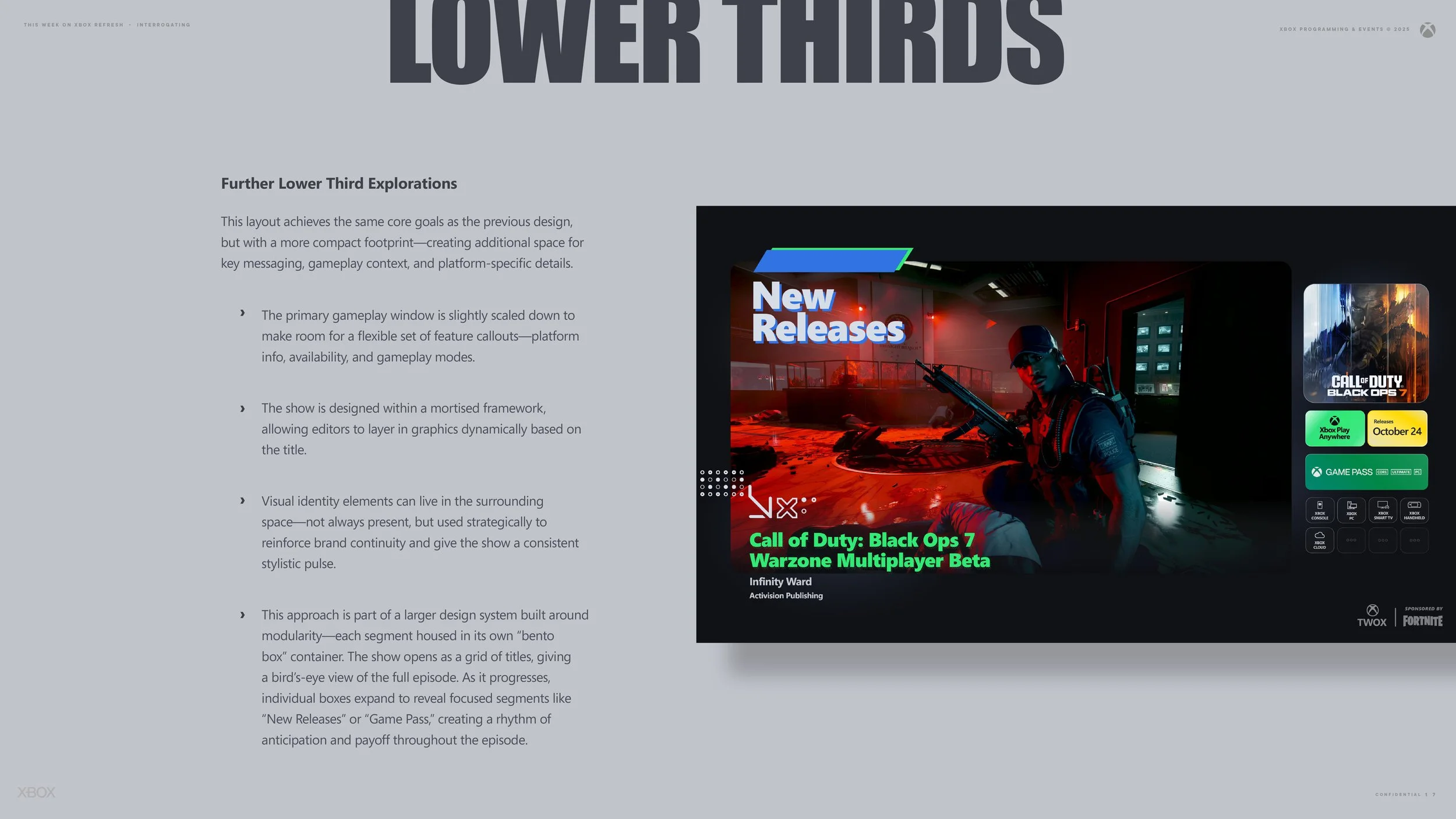
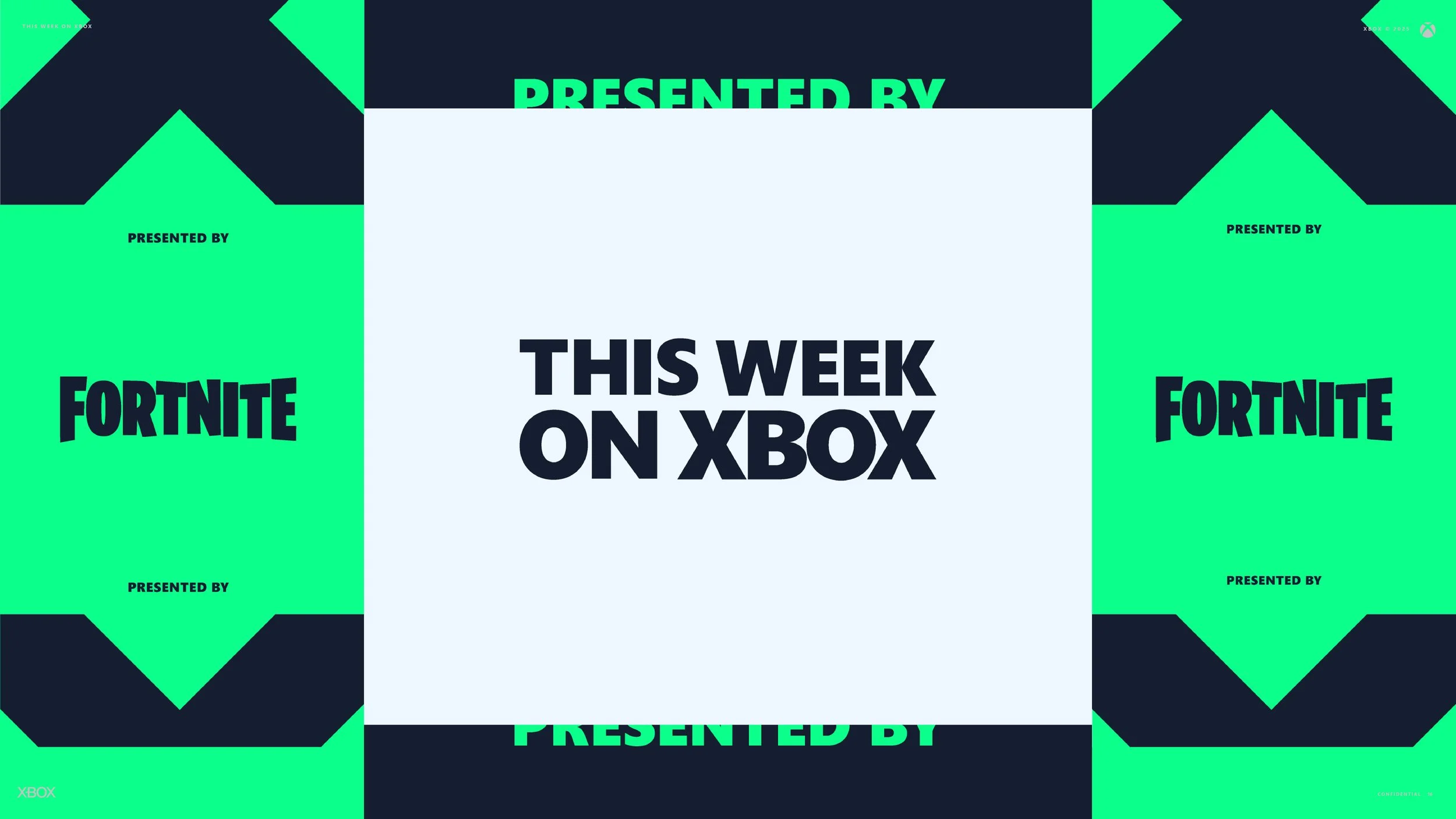
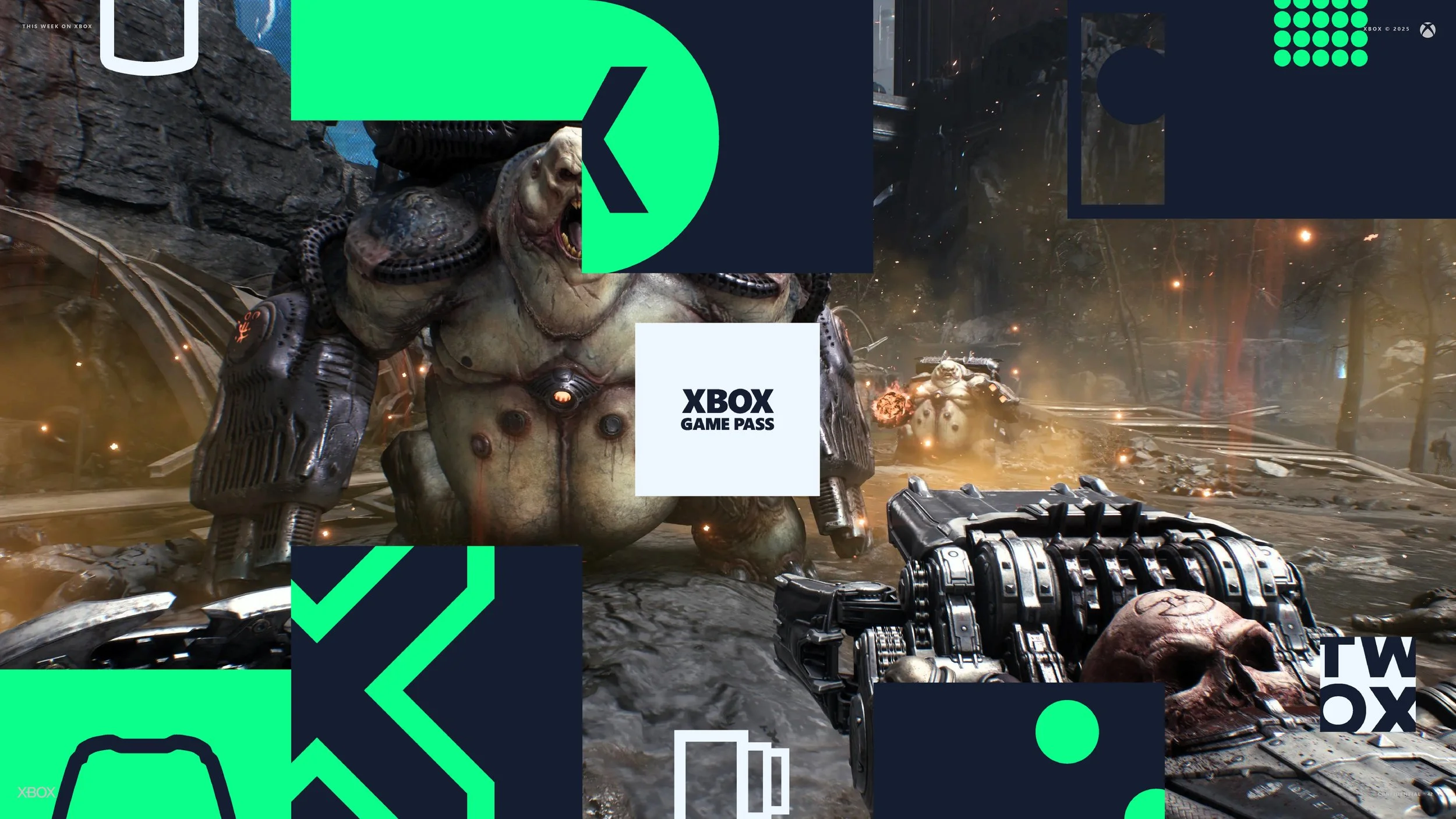
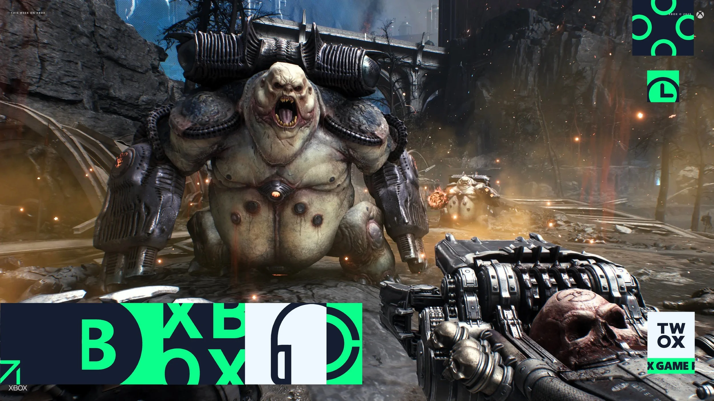
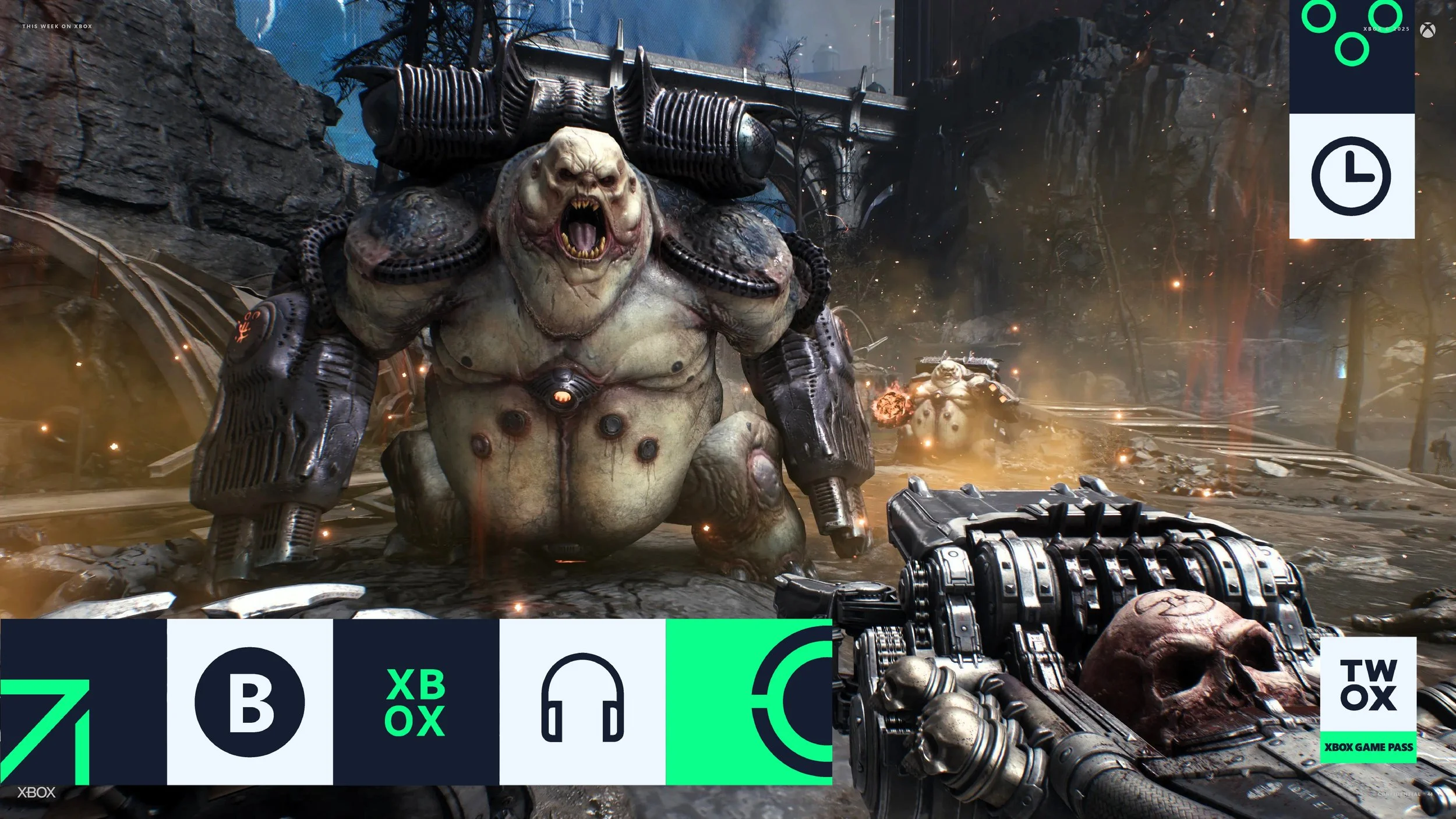
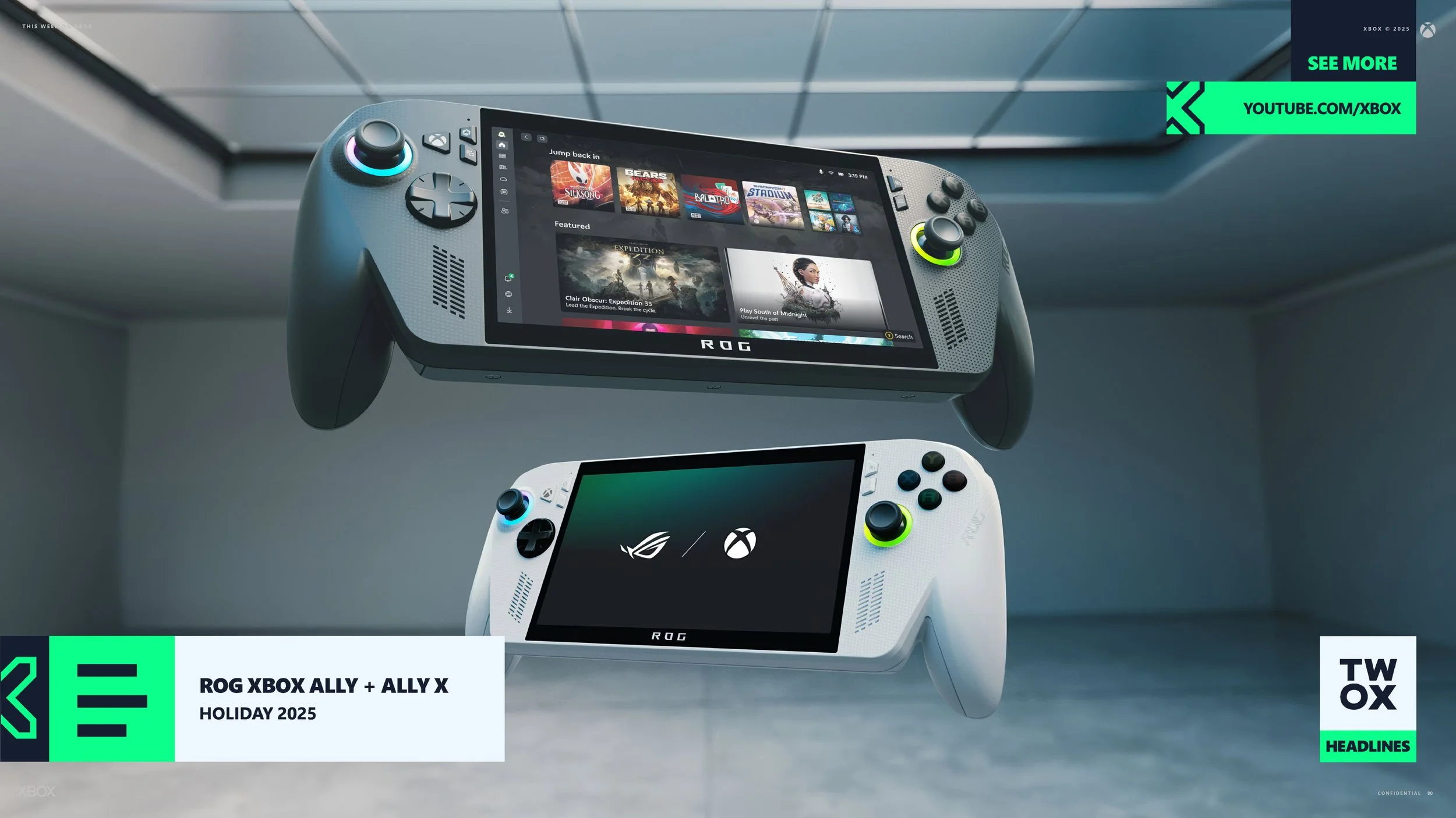
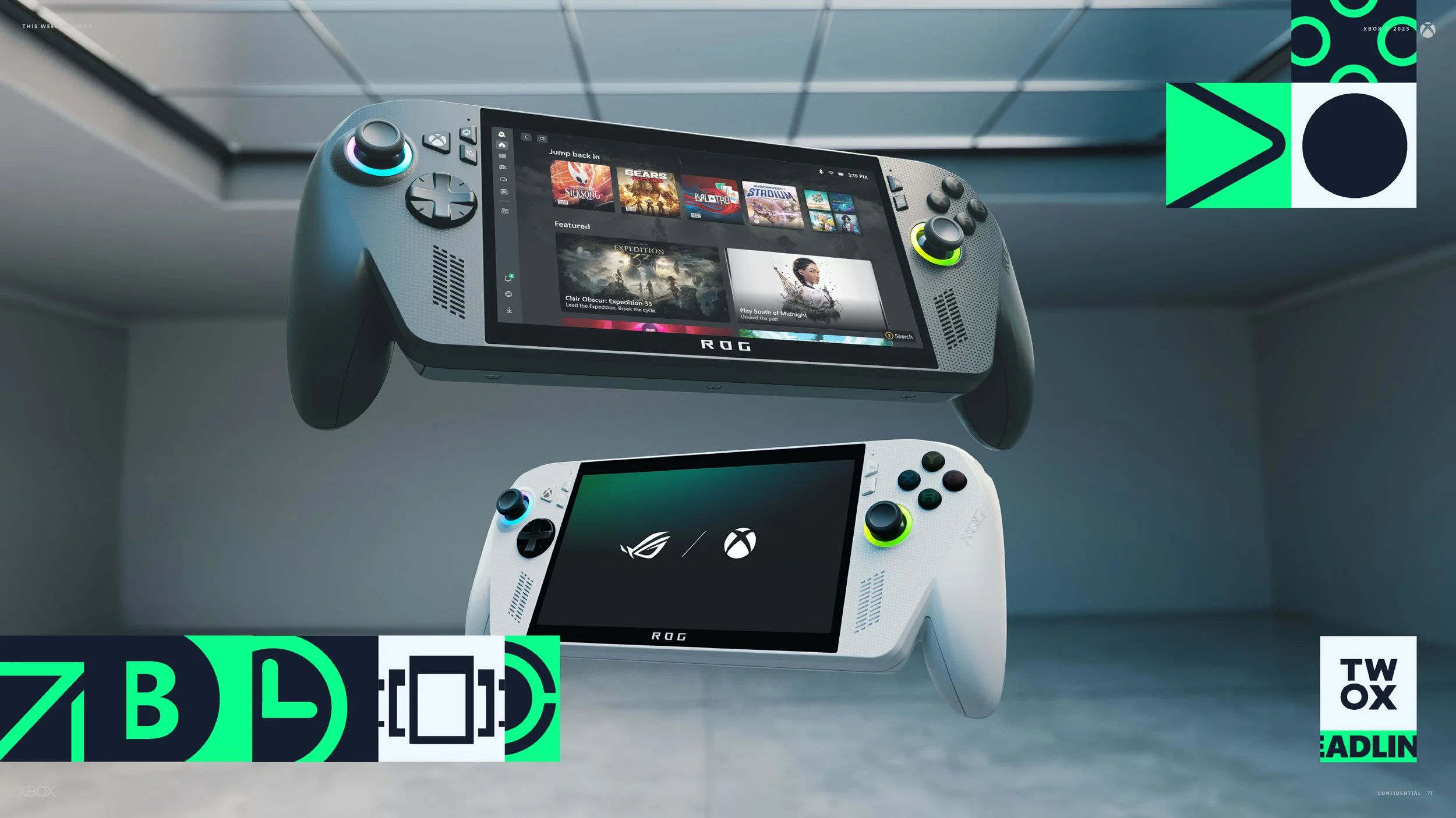
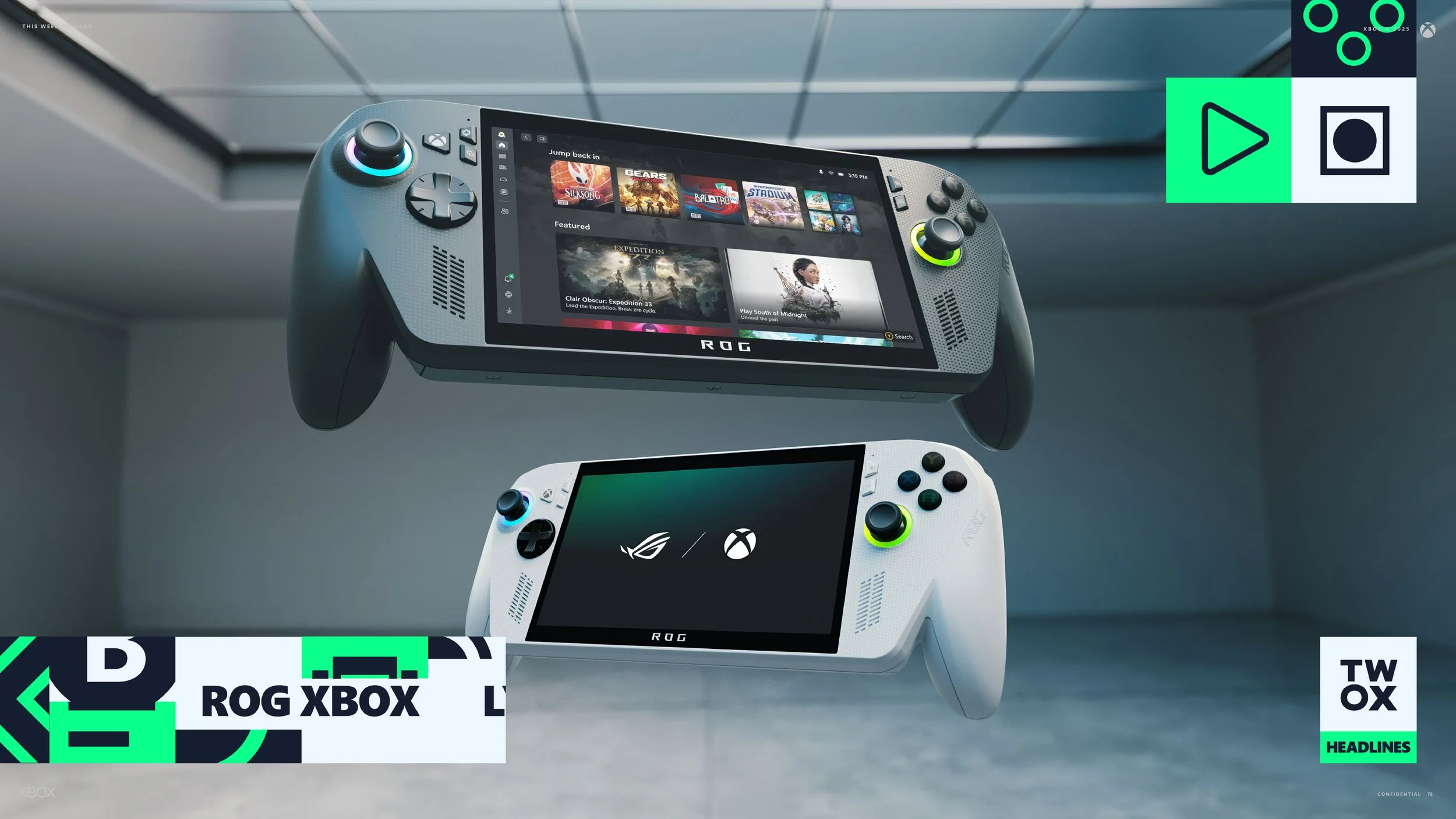
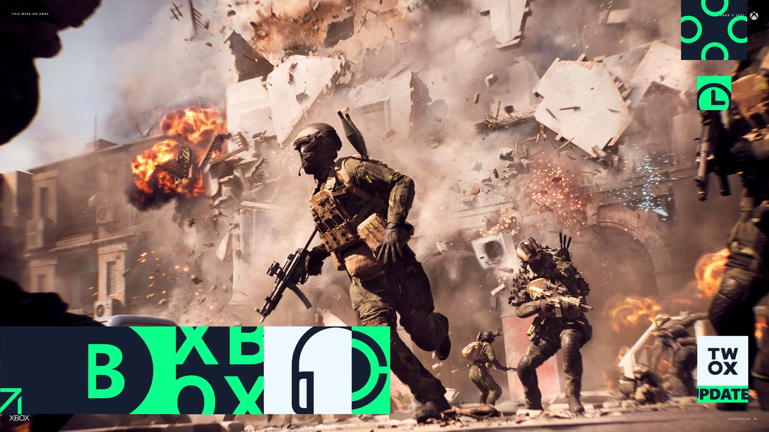
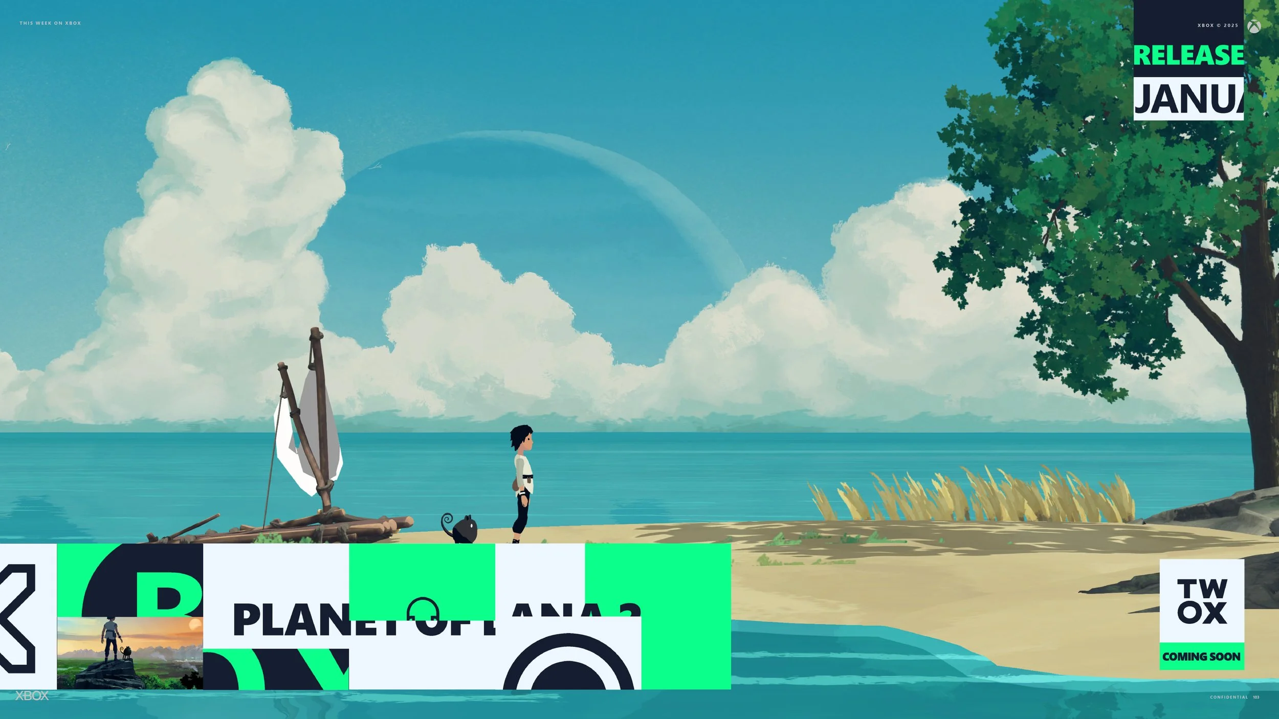
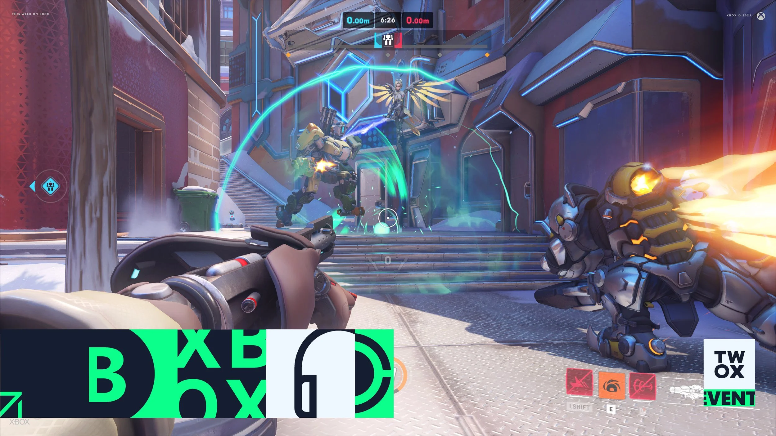
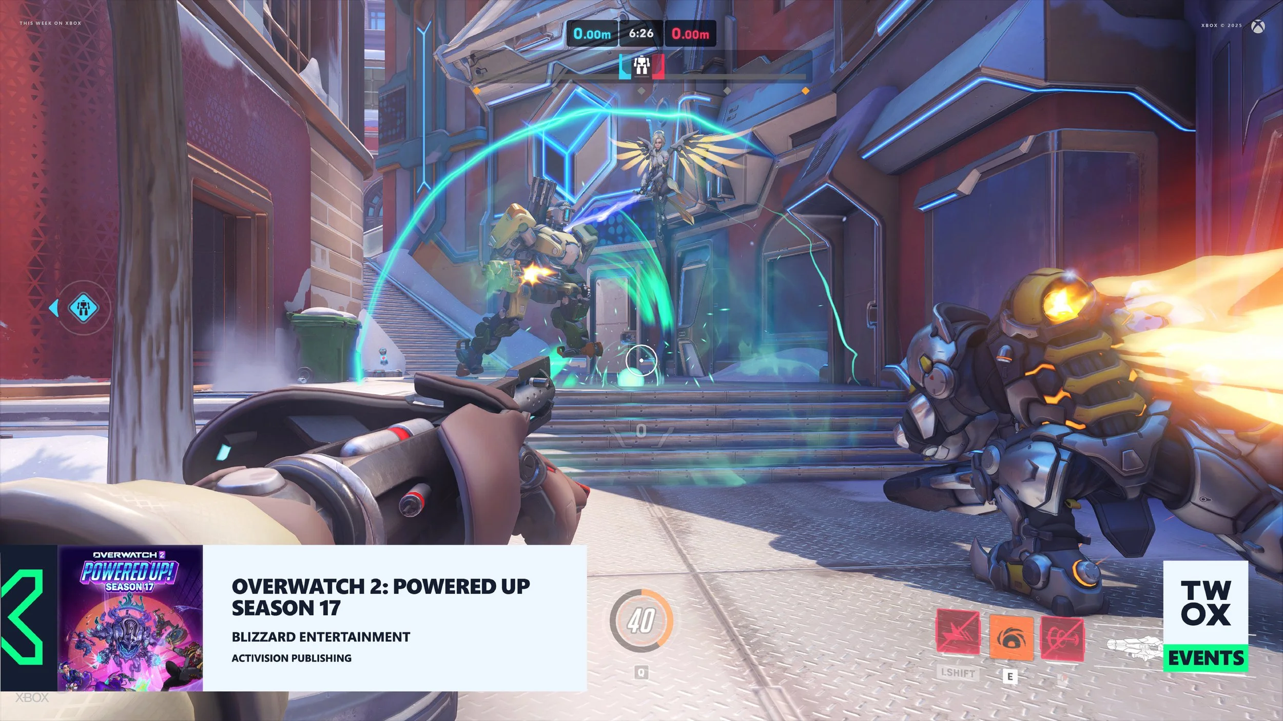
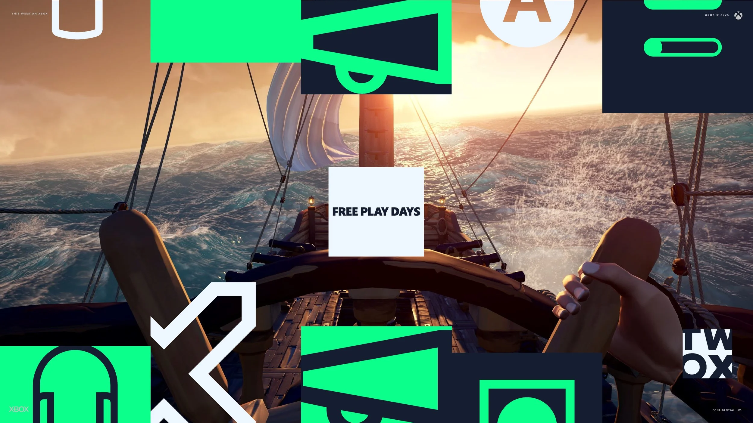
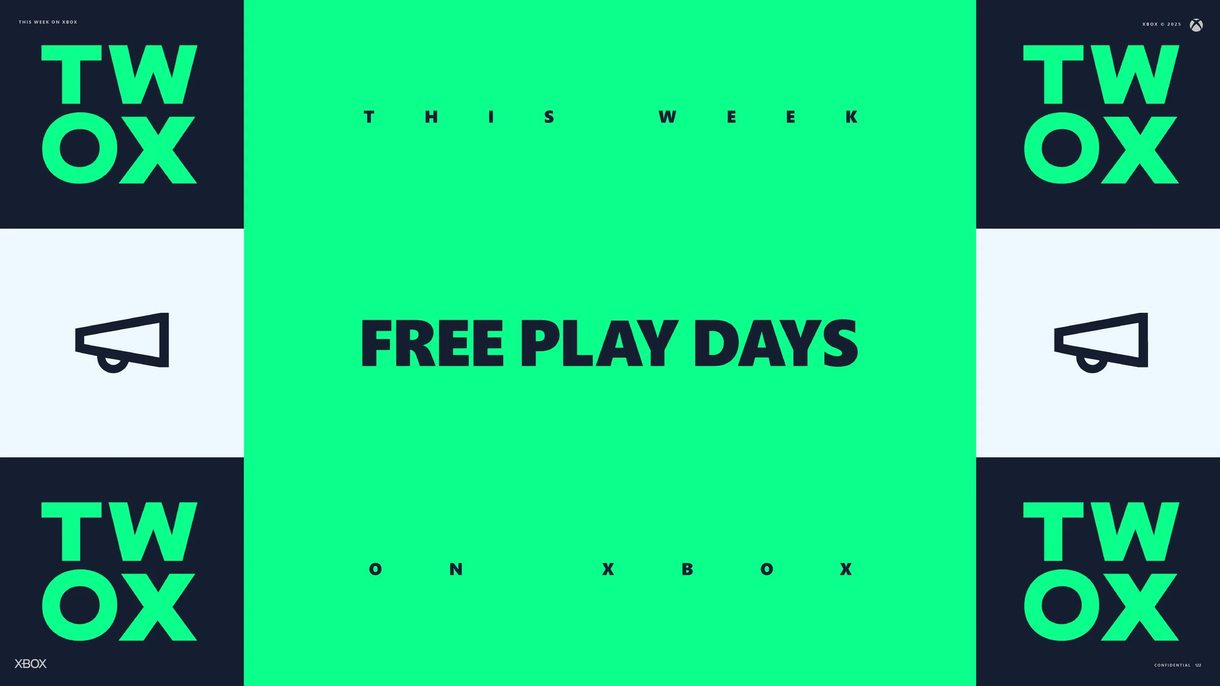
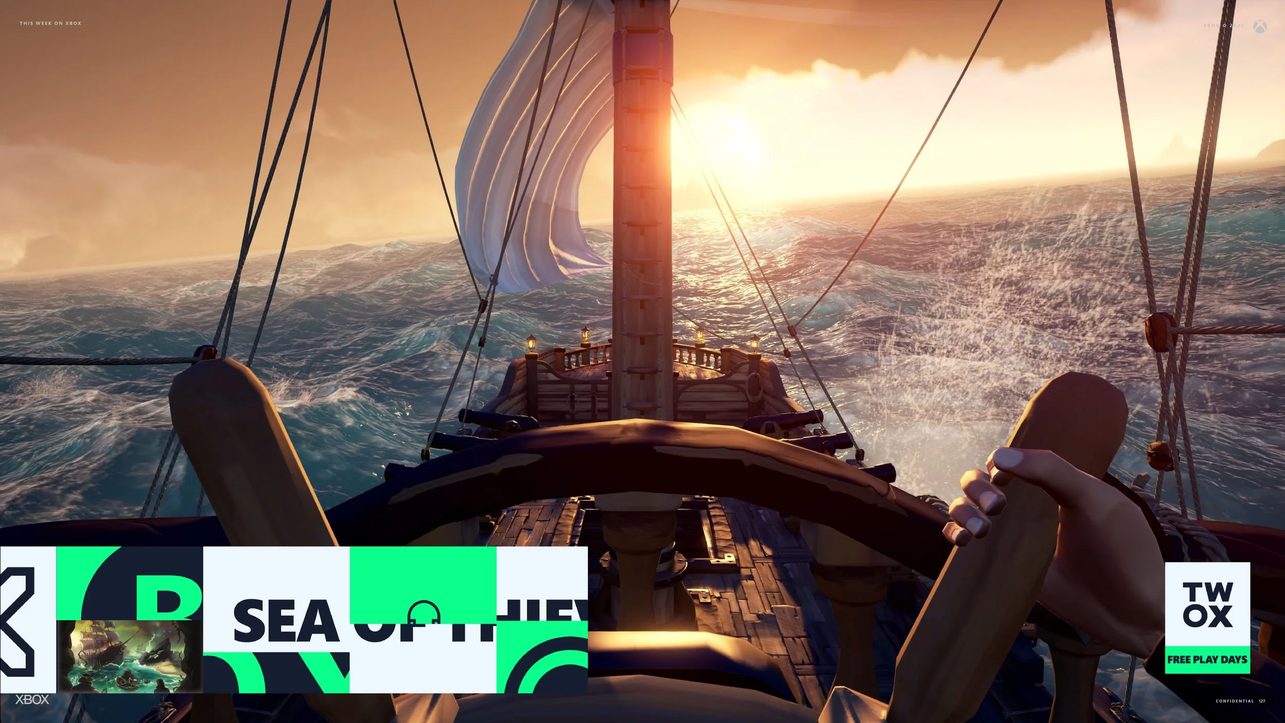
This page showcases a case study for This Week on Xbox. The video above is the final design. My deliverables included a full graphics package and a set of mock episodes in multiple social formats that editors across Microsoft can easily reuse.
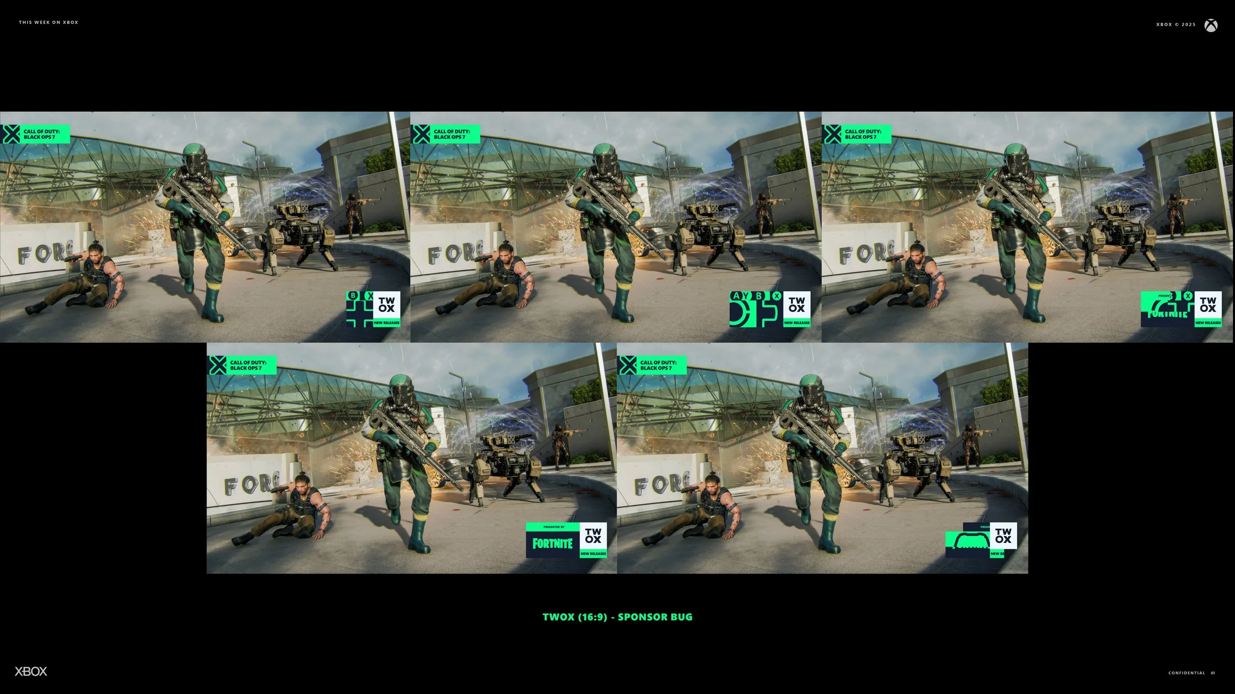
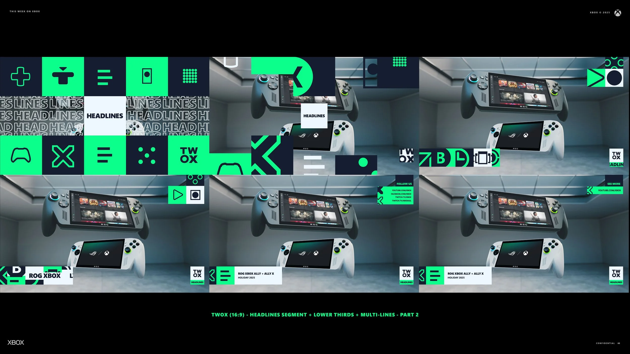
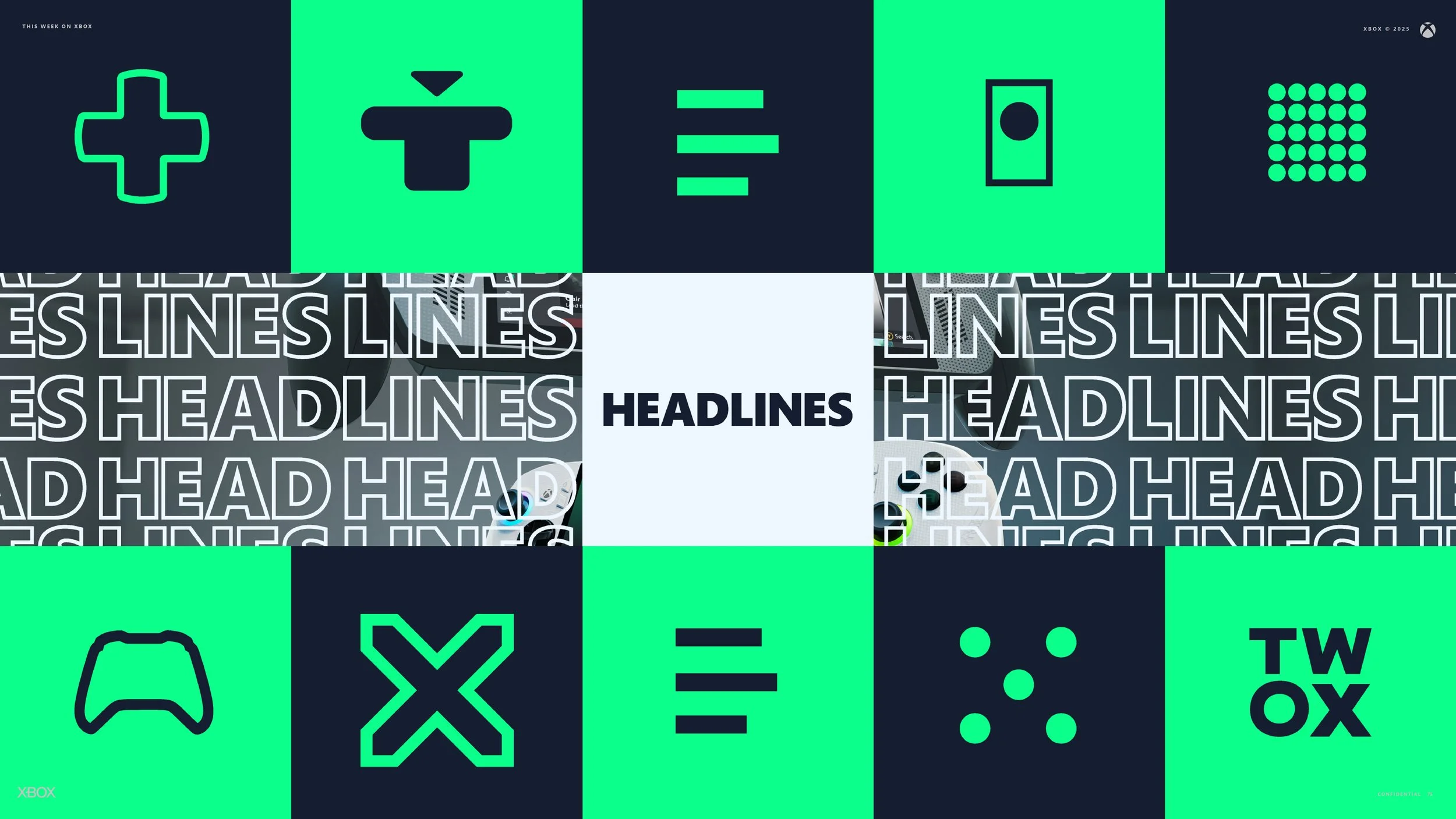
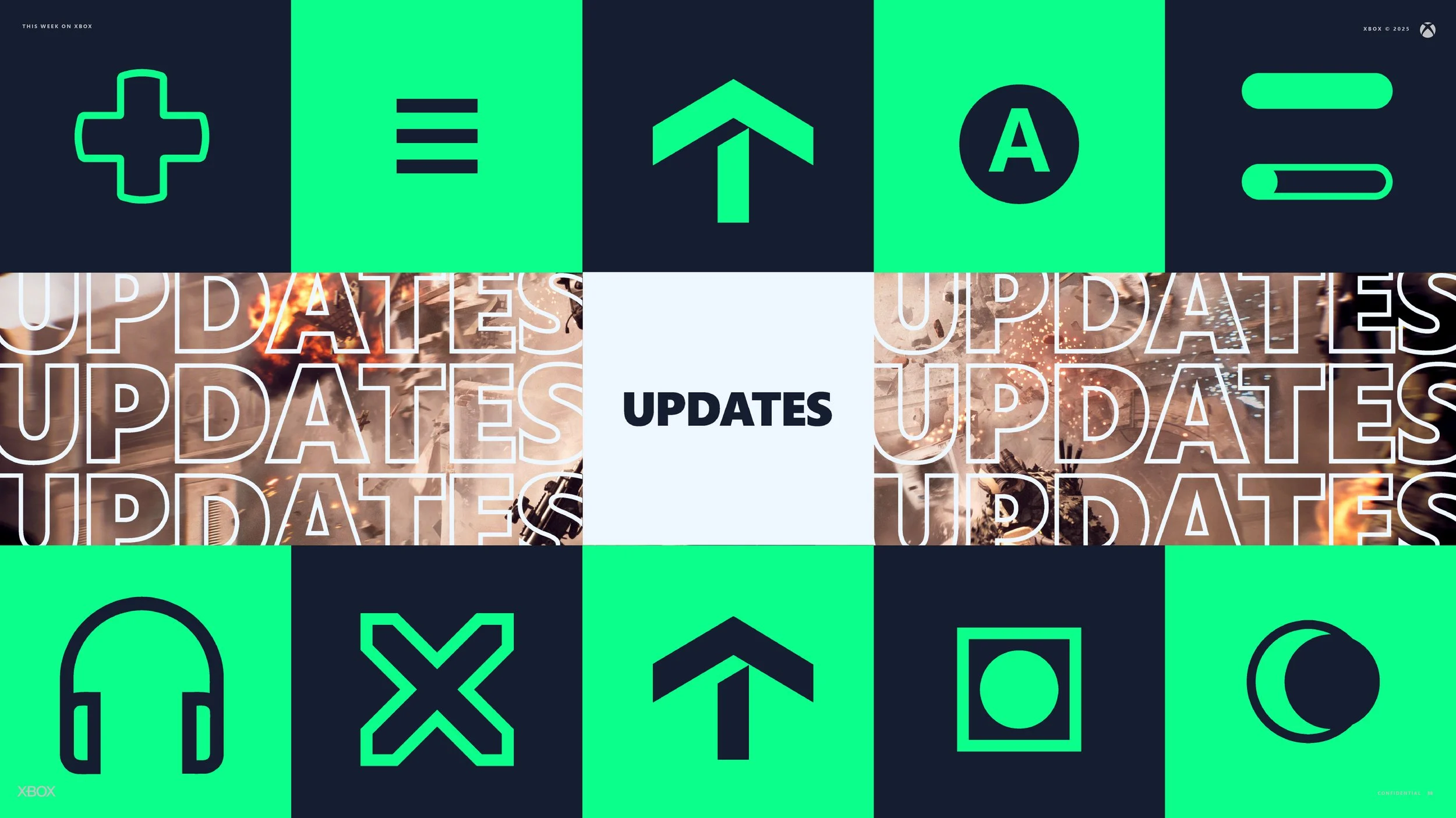
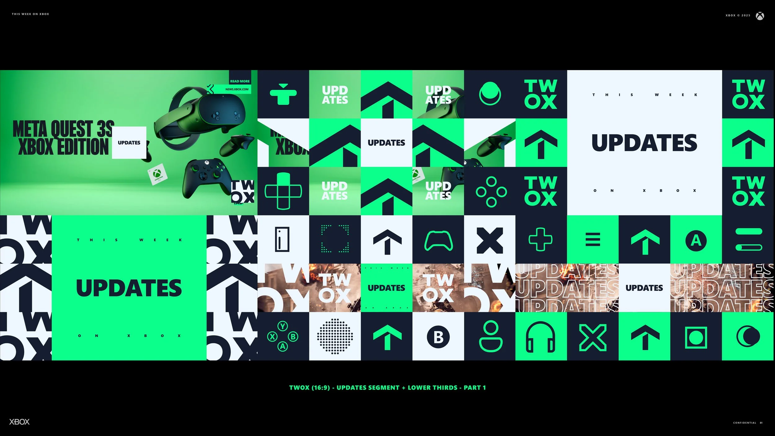
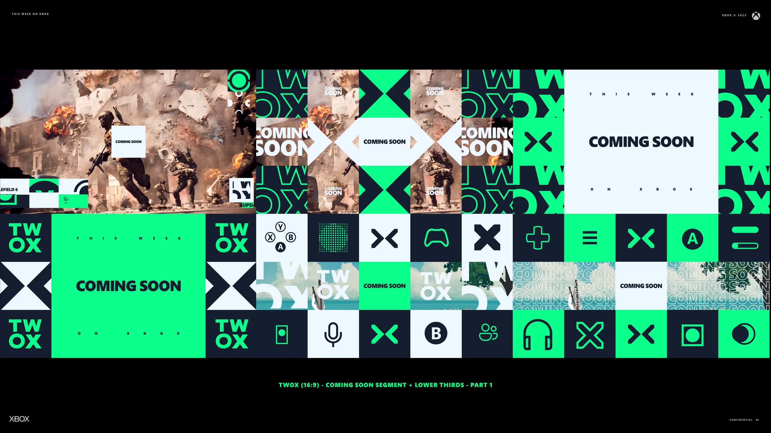
I built the After Effects motion design system to take the weight off their workflow. Expressions drive randomized iconography for each lower third and every on-screen element. All graphics respond cleanly to text length and shift automatically between 16:9, 9:16, and square outputs. Logos conform to the desired placements and provide options to stick with the defined color scheme or utilize the sponsor’s identity. The goal was simple. Build a package that carries Xbox identity with confident shape language and a layout system that stays consistent no matter who is behind the keyboard.
Creative Director: Dan Chosich
Producer: Brittany Brumfield
Producer: Hilary Smith
VFX, Design & Motion: Dan Chosich
Mock Episode Writer: Dan Chosich
Editor: Dan Chosich


Initial Design: Audit + Discovery
The process began with a full audit of the current show. I broke down every component. Graphics, sound effects, editing, VO, and writing. One clear issue stood out. The show packed too much information into a short run time, which made it harder for viewers to absorb. As a discovery engine, it needed to help people recognize titles, remember them, and always understand what segment they were watching.
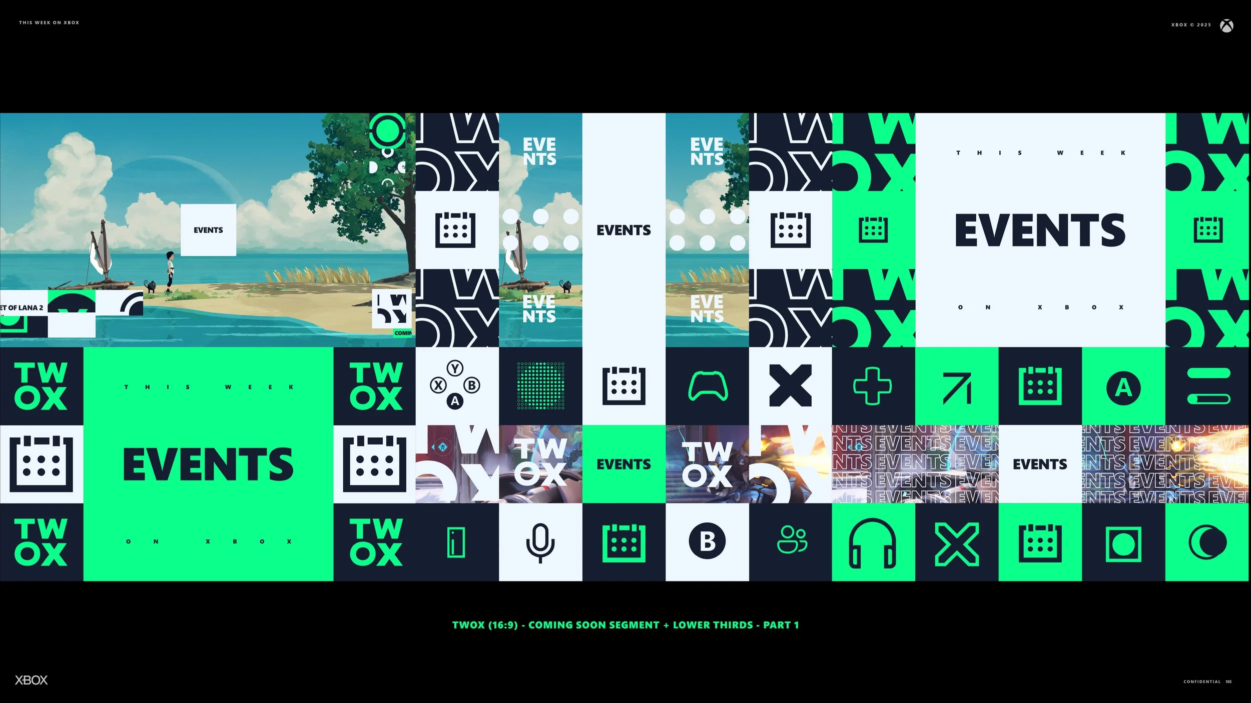
The slideshow above was the initial pitch and design. It was rough by design. I wanted to show the direction early, gather alignment, and then move into refinement.
I also did not have a design brief that fully articulated the Xbox brand. There were high-level guidelines, but nothing that captured the complete visual system. No central library. No Figma source. So I gathered every asset I could find and rebuilt the pieces that mattered. I focused on elements that could echo the brand, the hardware, and the identity of the platform.
From there I created a branding toolkit in Illustrator and InDesign. Every element of the redesign would draw from this foundational system, including lower thirds and transitions. Once that language was in place, I explored how it could translate into three dimensions. The iconography became physical, playful objects that could exist inside a real space. I brought everything into Cinema 4D, built clean UV’d meshes, and pushed the idea that the world behind Xbox is built to inspire play. The goal was to let the design carry that spirit forward.
Unused Direction
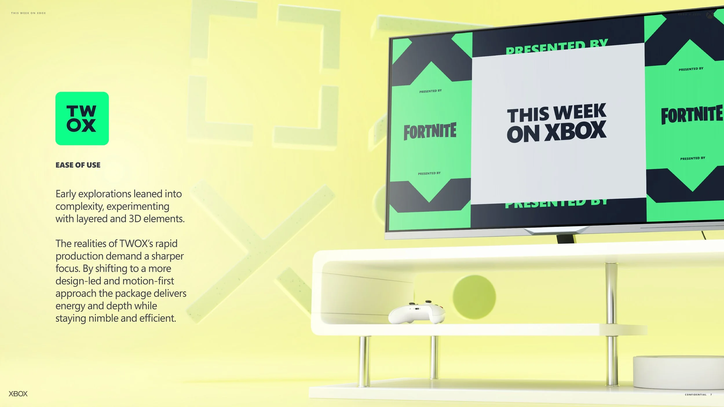
A lot of work went into this first direction, but as I developed it, I realized I had to make the call to walk away from it. Time was not on my side and my primary goal was to build a mock episode that editors could lift apart easily and adapt for any sponsor. The moment I realized the 3D work would slow them down, the decision made itself. If the team cannot move quickly, if inserting a logo becomes a chore, then the system is not serving the people who need it most.
Switching to a more graphic approach brought the whole package into focus. It kept the architecture of the design system intact while creating something fast, clear, and accessible for a wide range of editors. In the end, that cohesion is what makes the show feel unified and keeps the sponsor message front and center.
This direction was created in Cinema 4D and rendered with Redshift.
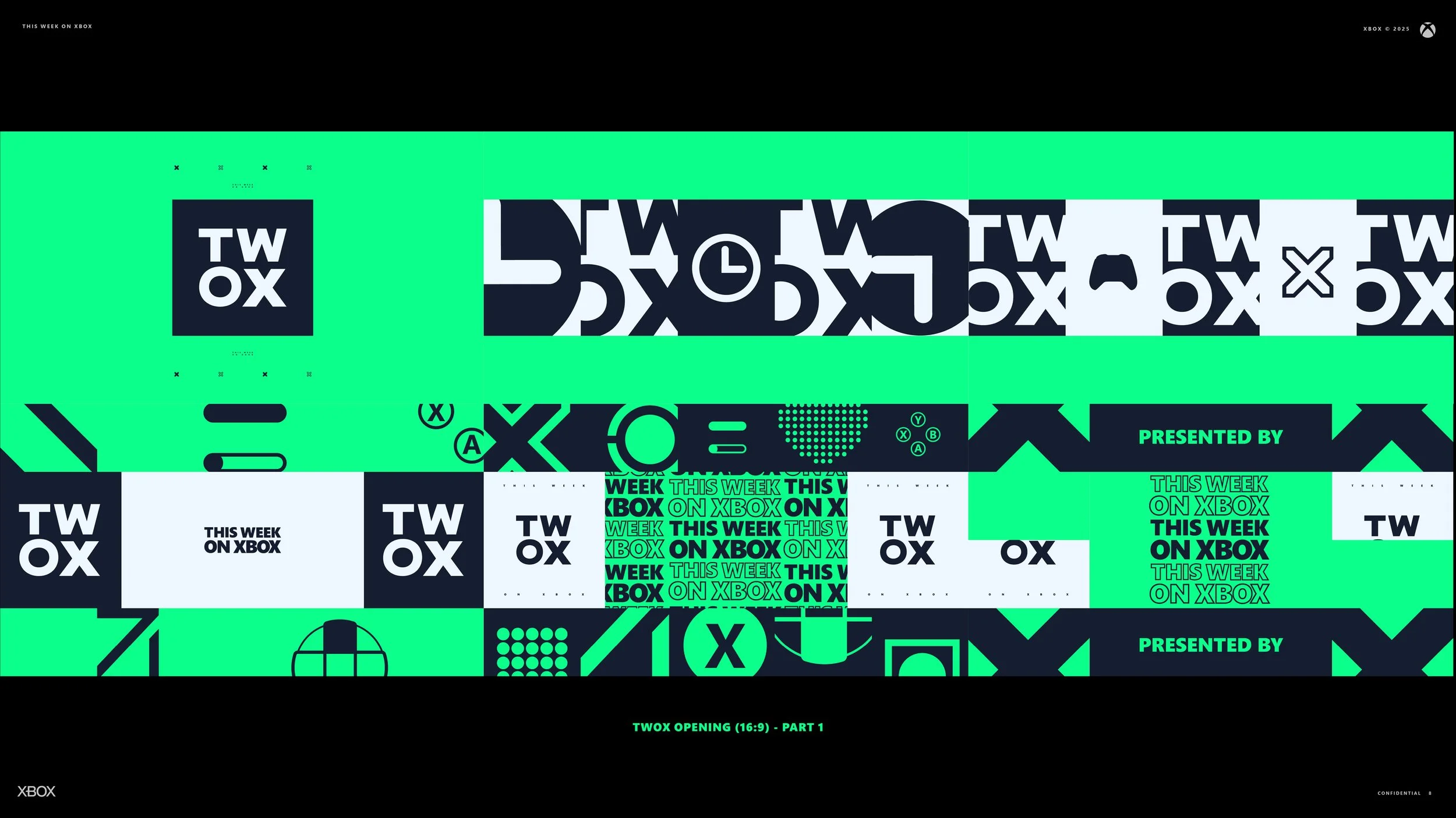
The Redesign
Below is the document I used to pitch the design pivot. I had roughly four weeks to design and animate the entire package, but I knew it would hold because it followed clear rules and stayed close to the core Xbox identity. It echoed the simplicity and confidence of recent campaigns like “This is an Xbox” while giving the show a stronger visual identity.
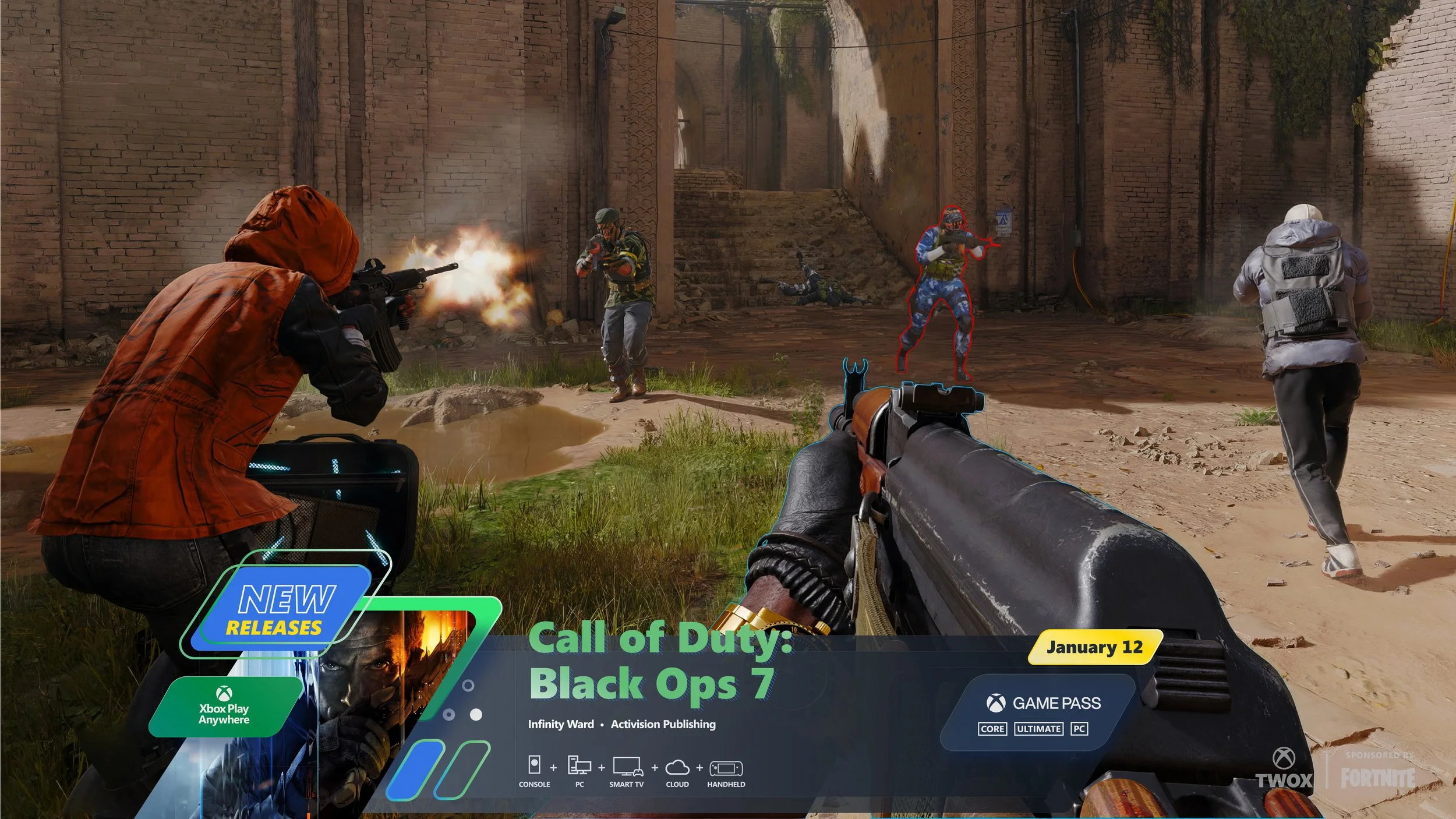
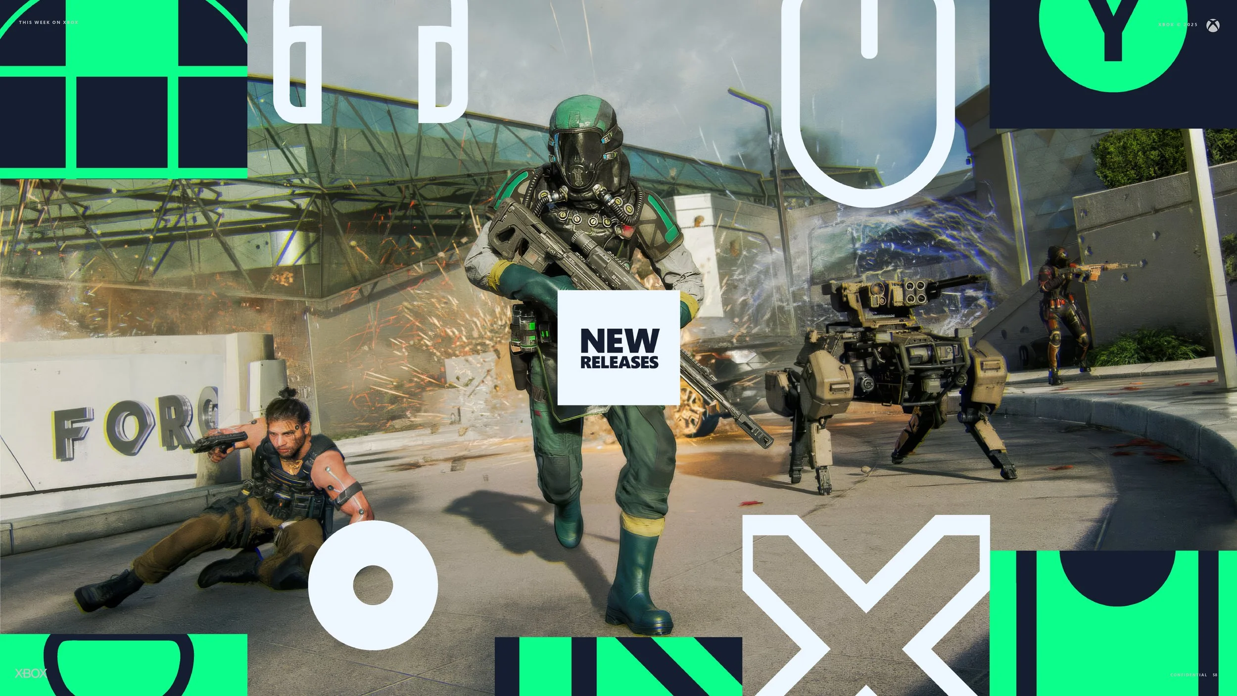
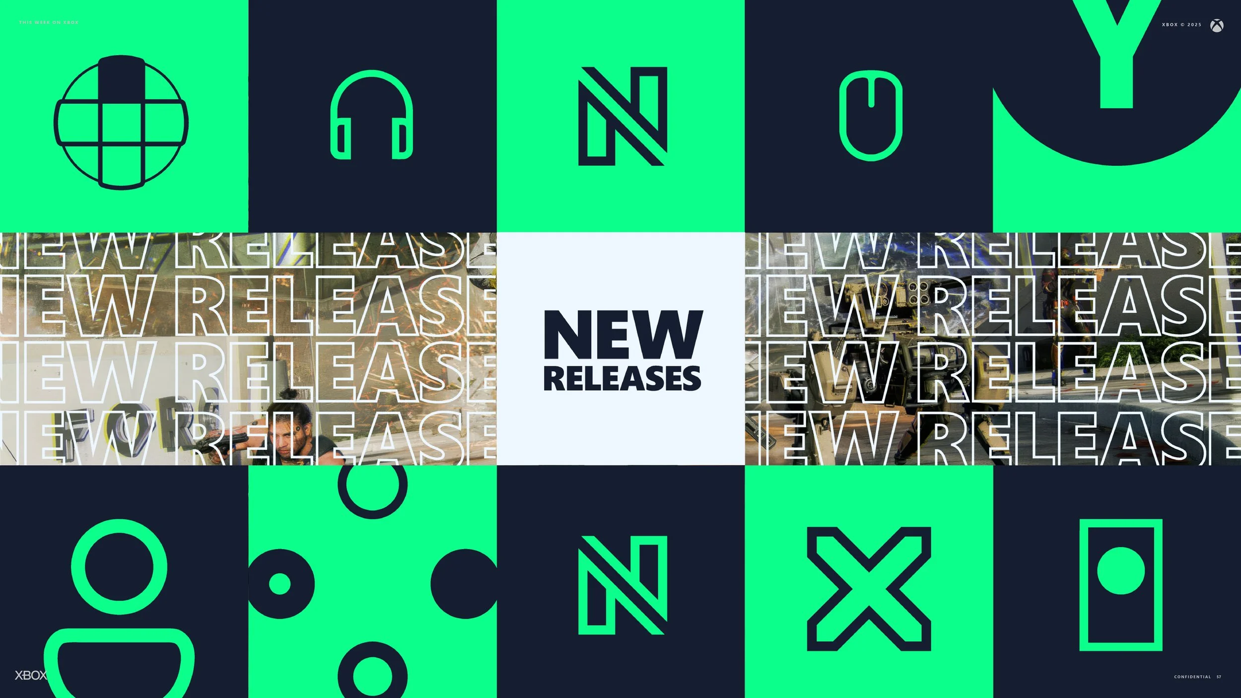
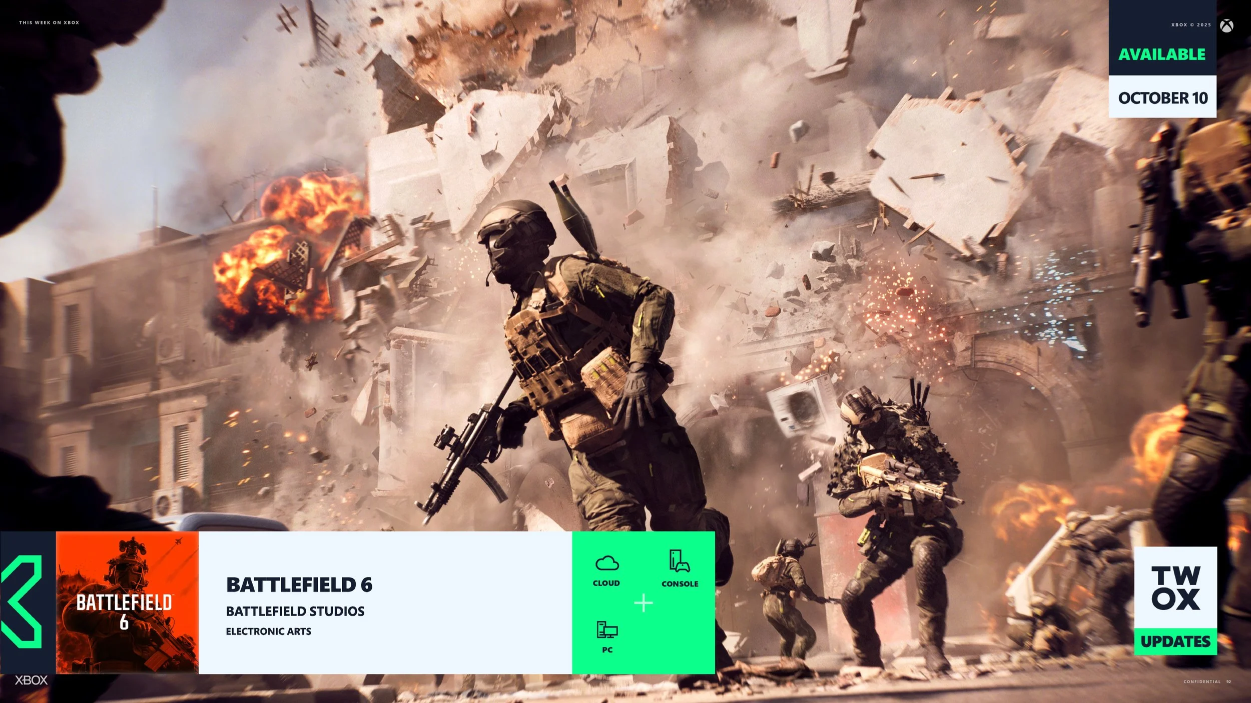
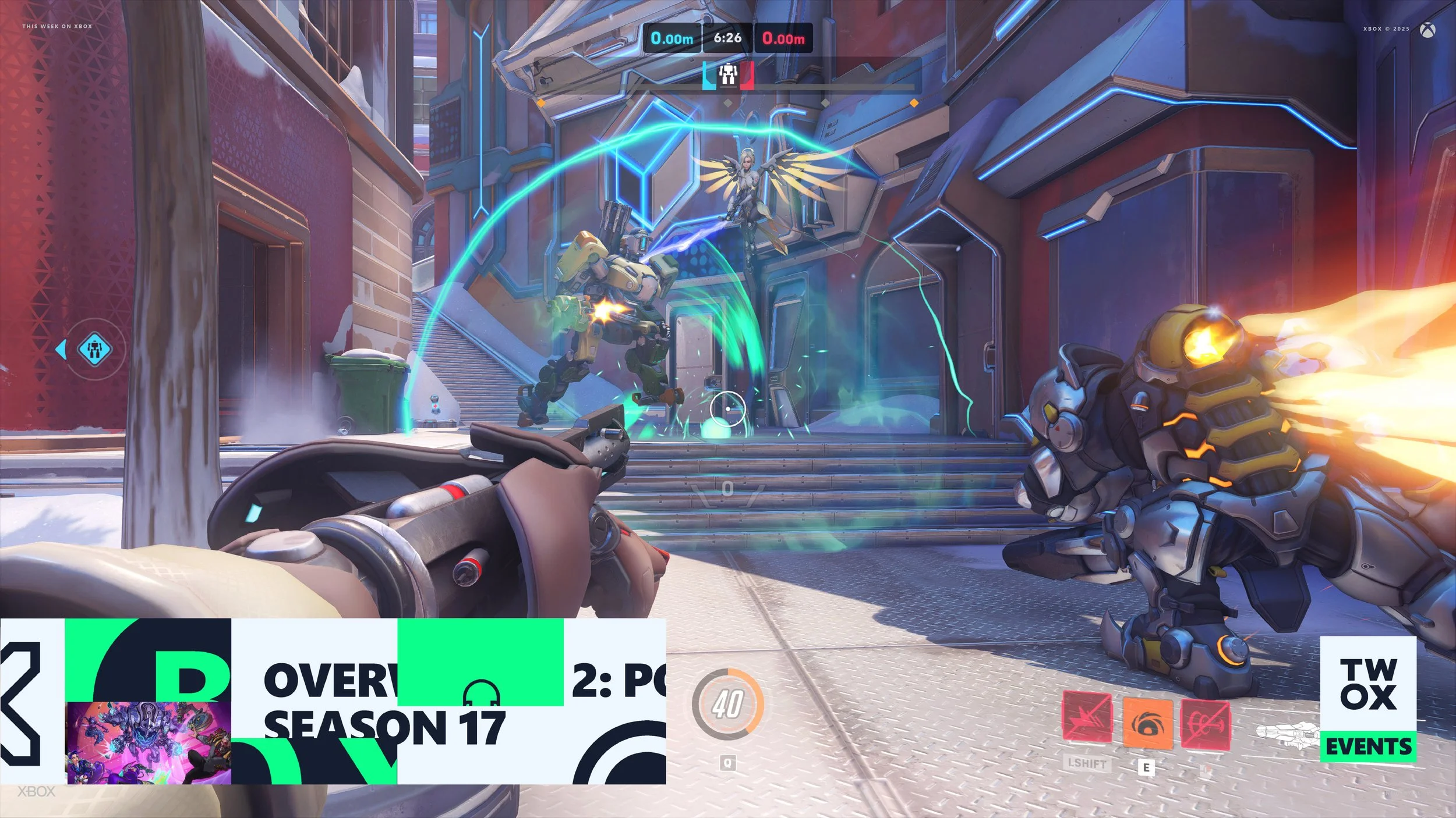
The driving decision was to build something extensible to other editors. That meant making every element easy to update. Text swaps, box art changes, platform clarity, all handled without friction. I created a responsive lower third system in After Effects that used checkboxes to adapt to each game. The design changed automatically based on predefined logic, adding or removing elements tied to Console, Handheld, Cloud, or PC availability.
The goal was simple. Build a system that feels fresh and cohesive, restores clarity to the show, renders quickly, and helps a rotating team of editors ship weekly episodes with confidence.


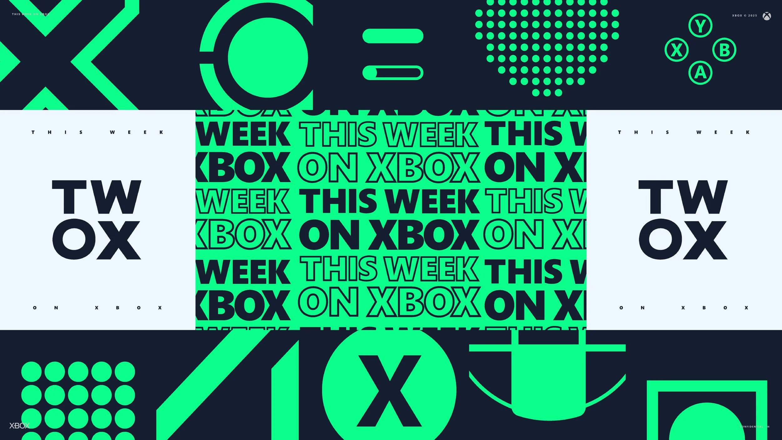


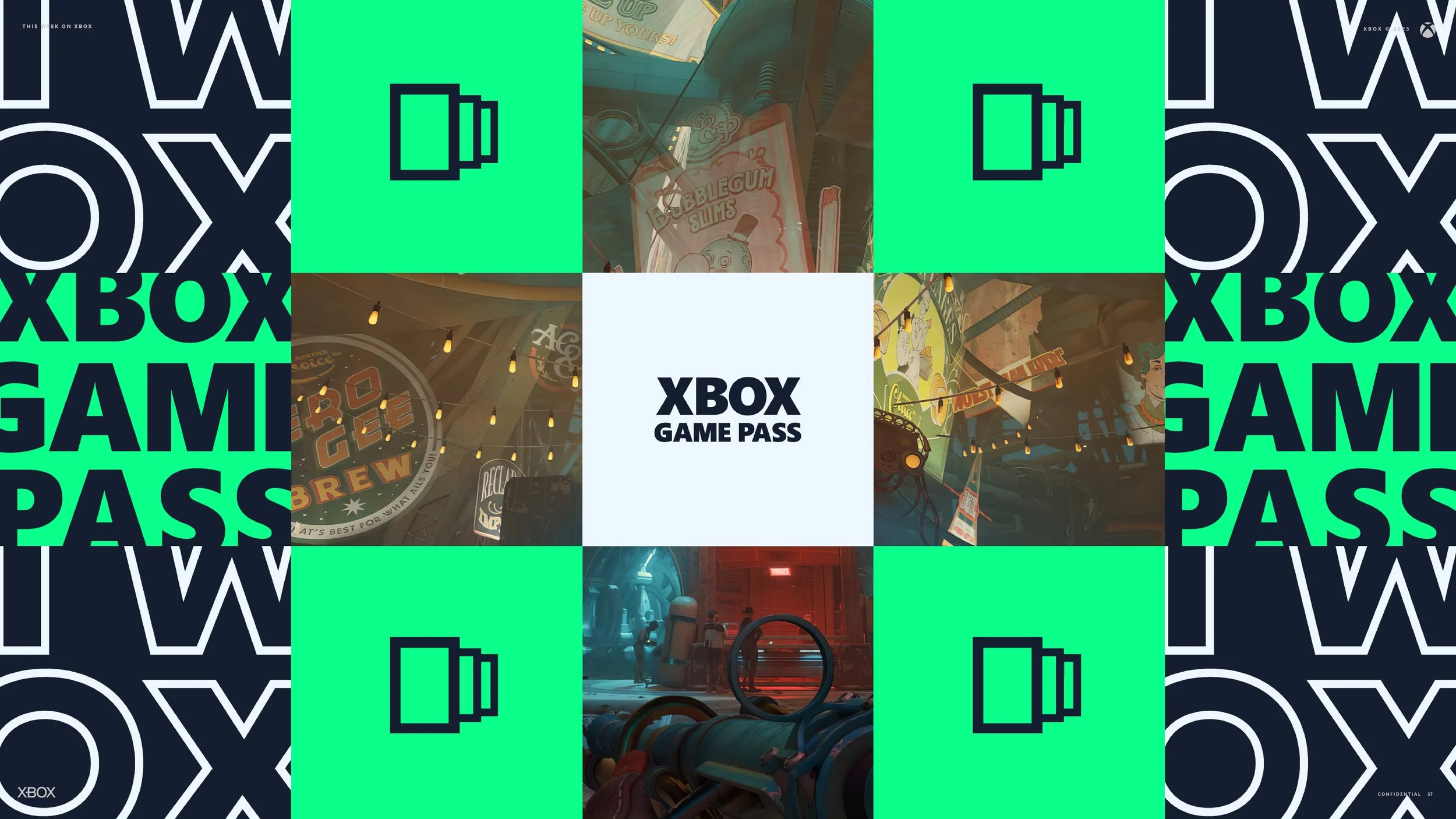
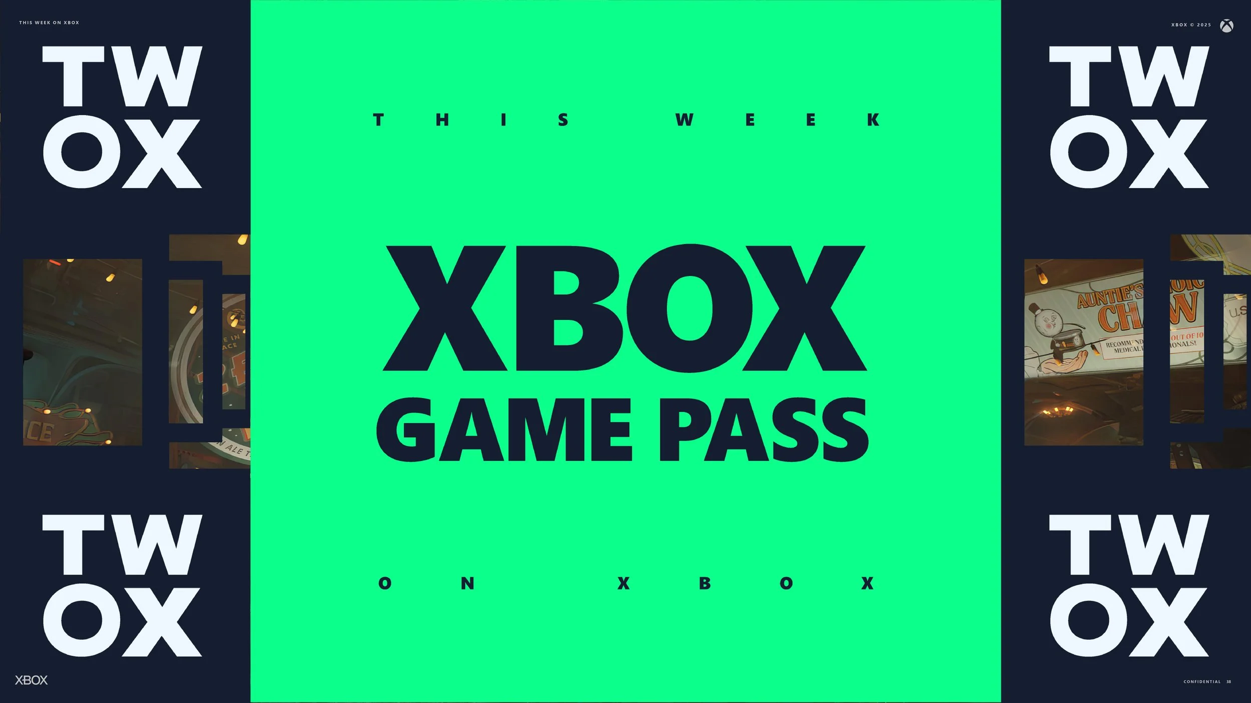


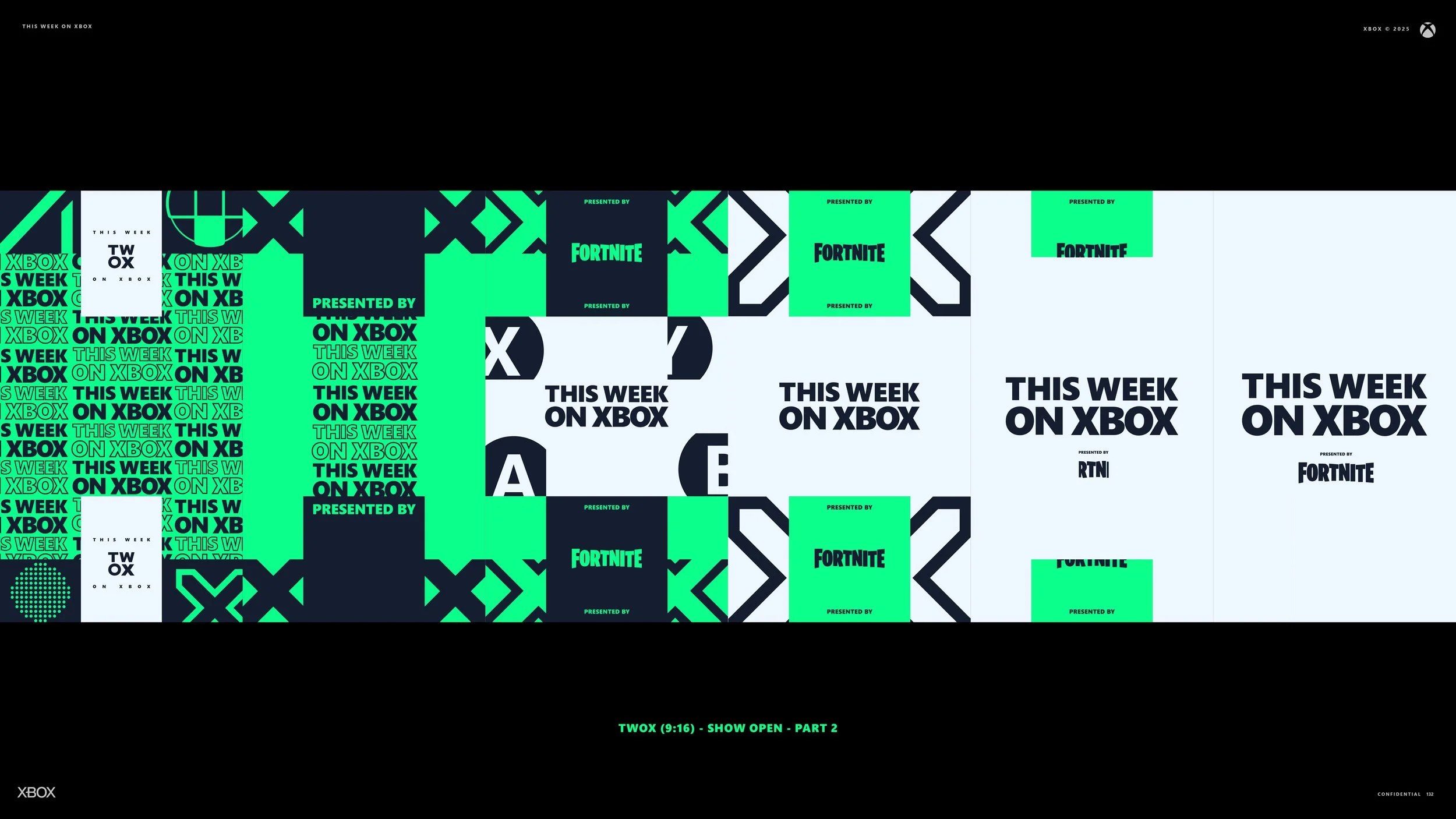


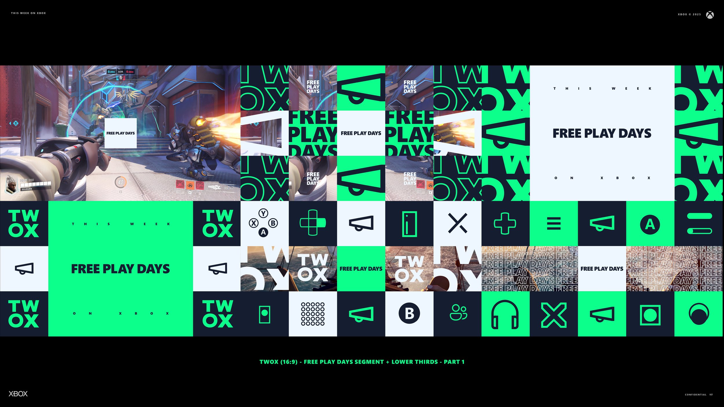


Various Aspect Ratios
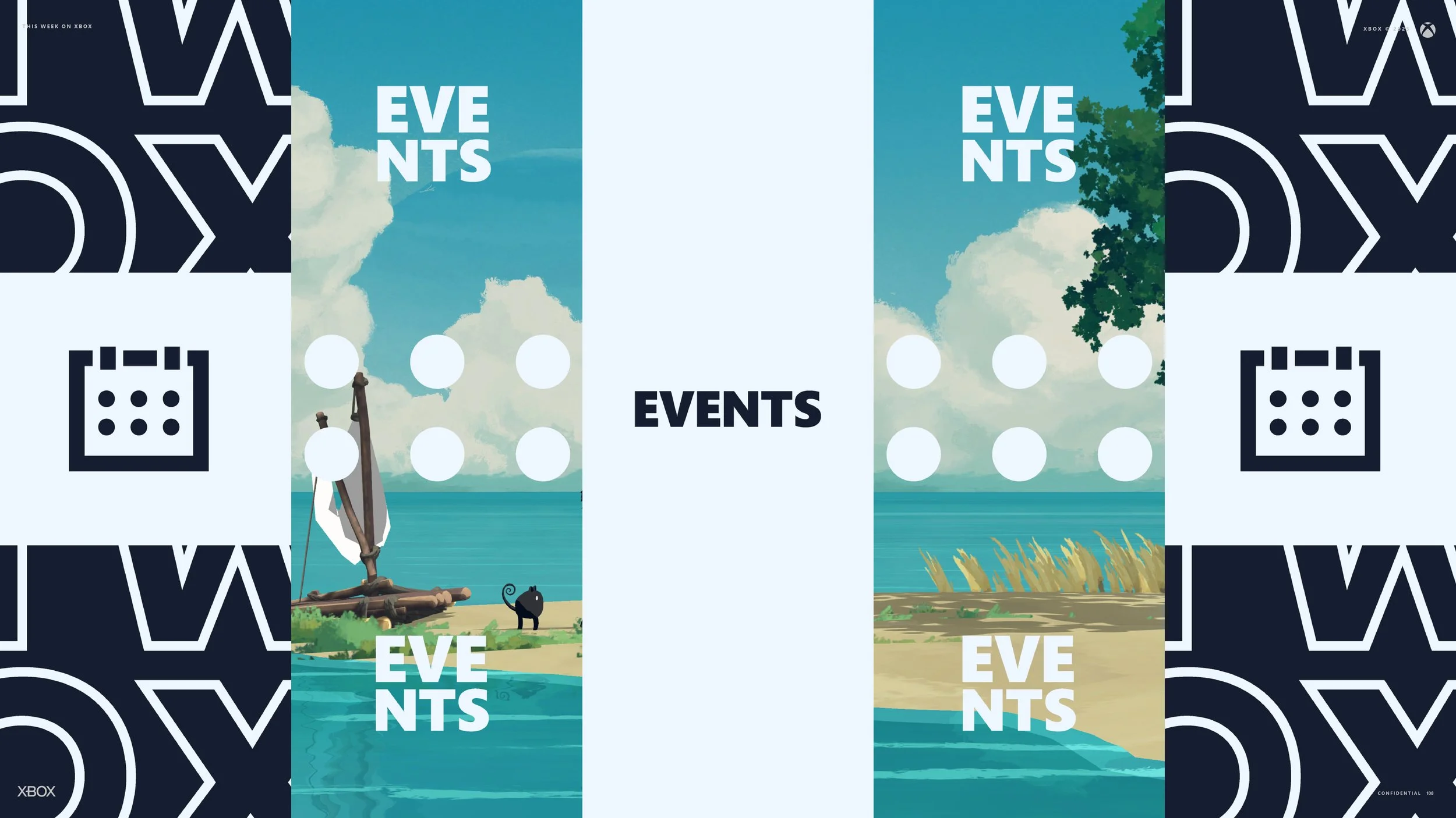
The videos above demonstrate how the content scales across multiple aspect ratios. One is built for 9x16 and the other for a square format. This required rethinking the show open for each, but the underlying structure made the shift far easier. Everything was built on a grid that referenced the comp size, so when the aspect ratio changed the system simply resized the elements to remain visually proportional. That saved a significant amount of time.
The 16:9 version, designed for television and YouTube, is its own experience. It features a different set of animations, more deliberate pacing, and a tone suited for a sit back style of viewing. Yet at a fundamental level both versions use the same controls and the same internal hooks. Editors can move between formats quickly and deliver consistent content without reinventing anything.